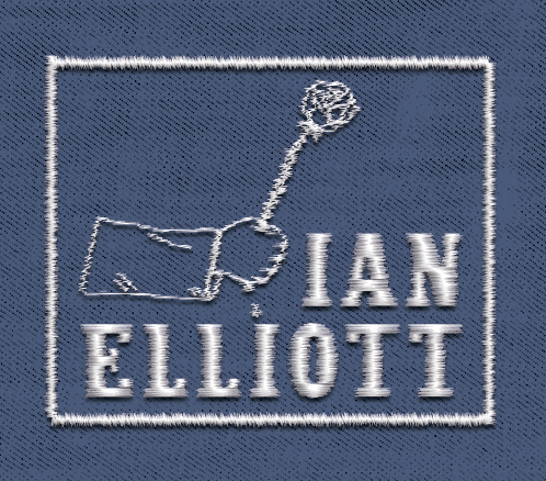
Ian elliott
Type Design
Lettering for an indie singer-songwriter.
CREATIVE BRIEF
A singer-songwriter needing custom lettering for their branding. Their references for comparable musicians - genre and target audience-wise - included artists like Noah Kahan, Hozier, Leon Bridges, Benson Boone, and Bon Iver. The only artistic direction was for the logo to be font driven (doesn't want a certain letter turned into another object, for example) and for it to not be too "techy."
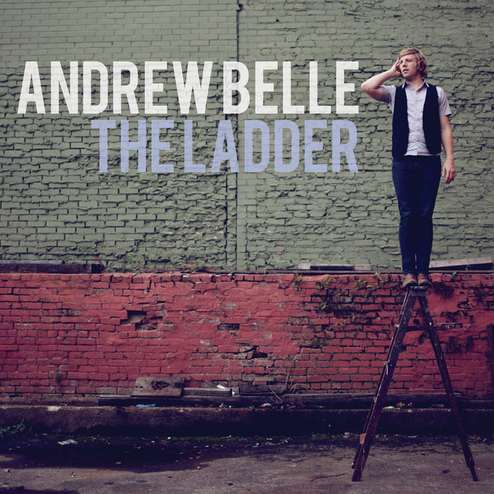
"The Ladder" by Andrew Belle
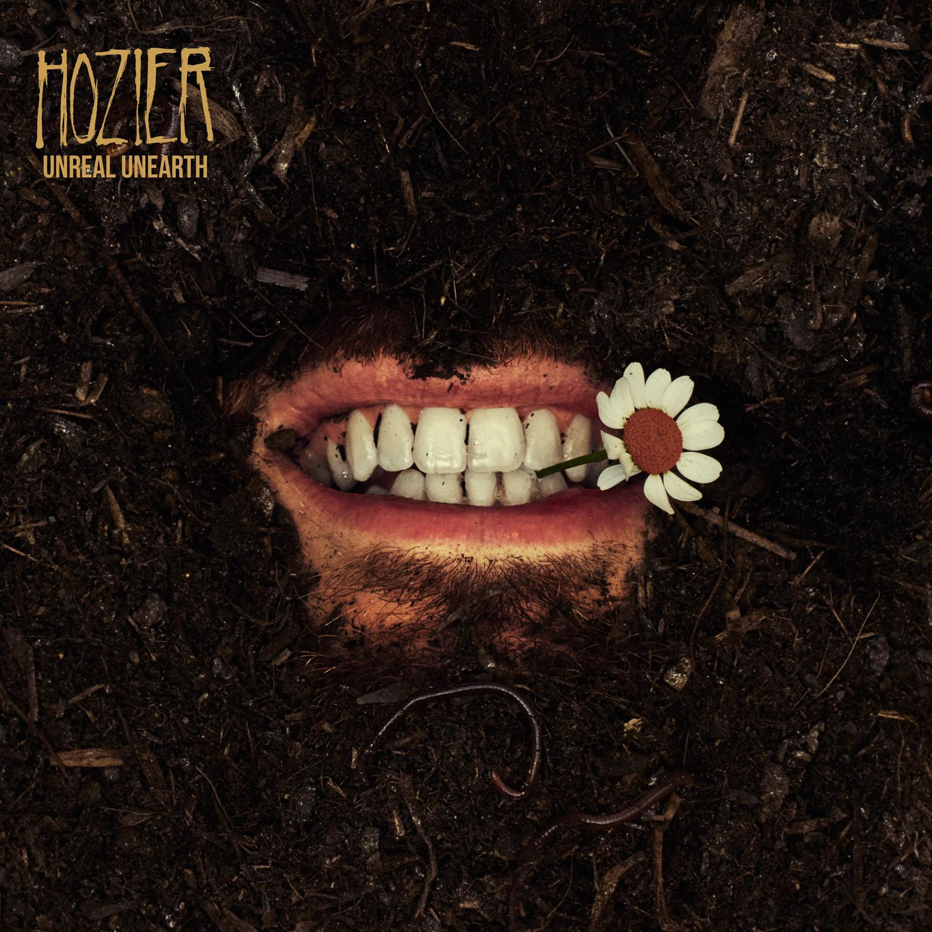
"Unreal Unearth" by Hozier
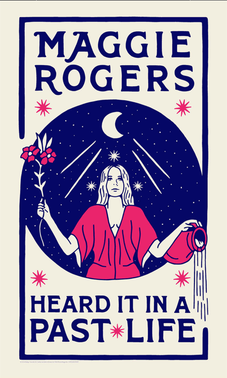
"Heard It In A Past Life" Poster from Maggie Rogers
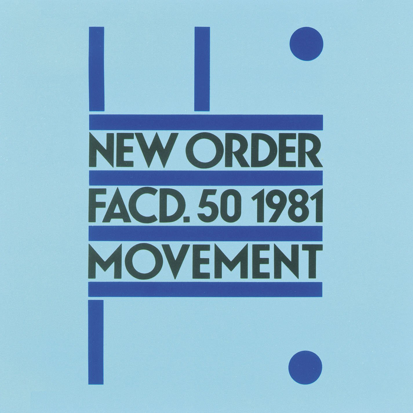
"Movement" by New Order
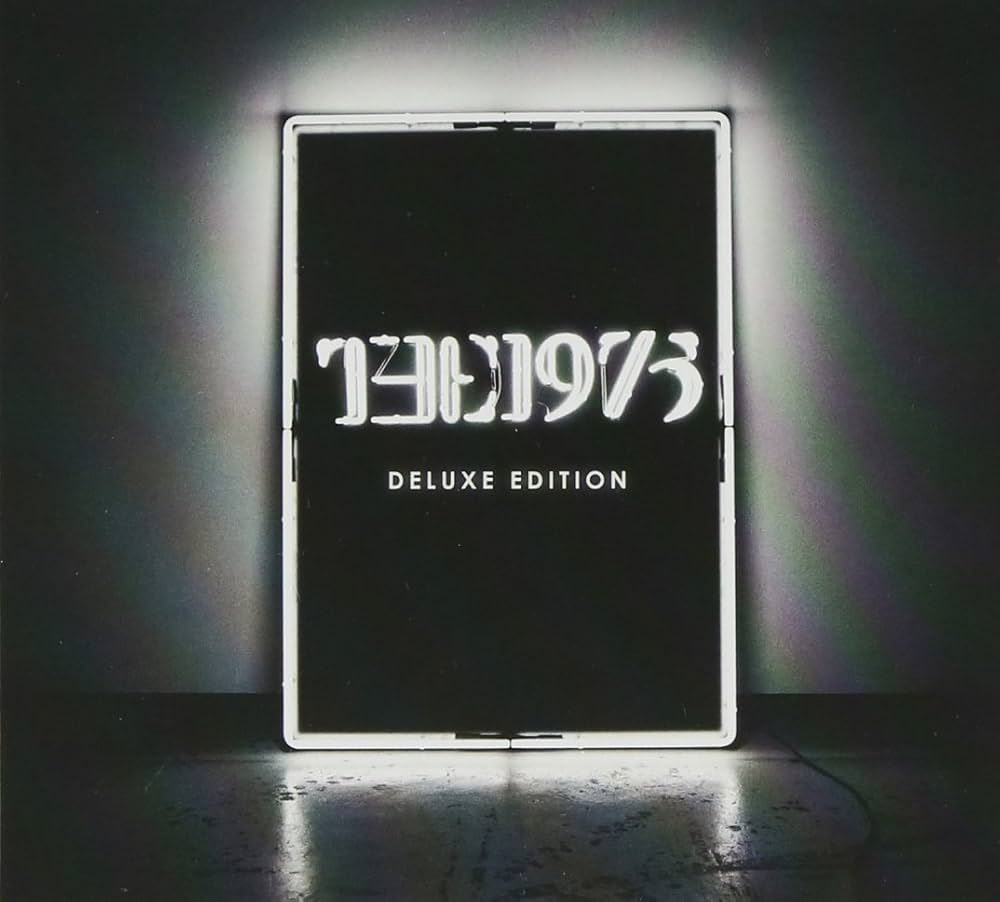
The 1975
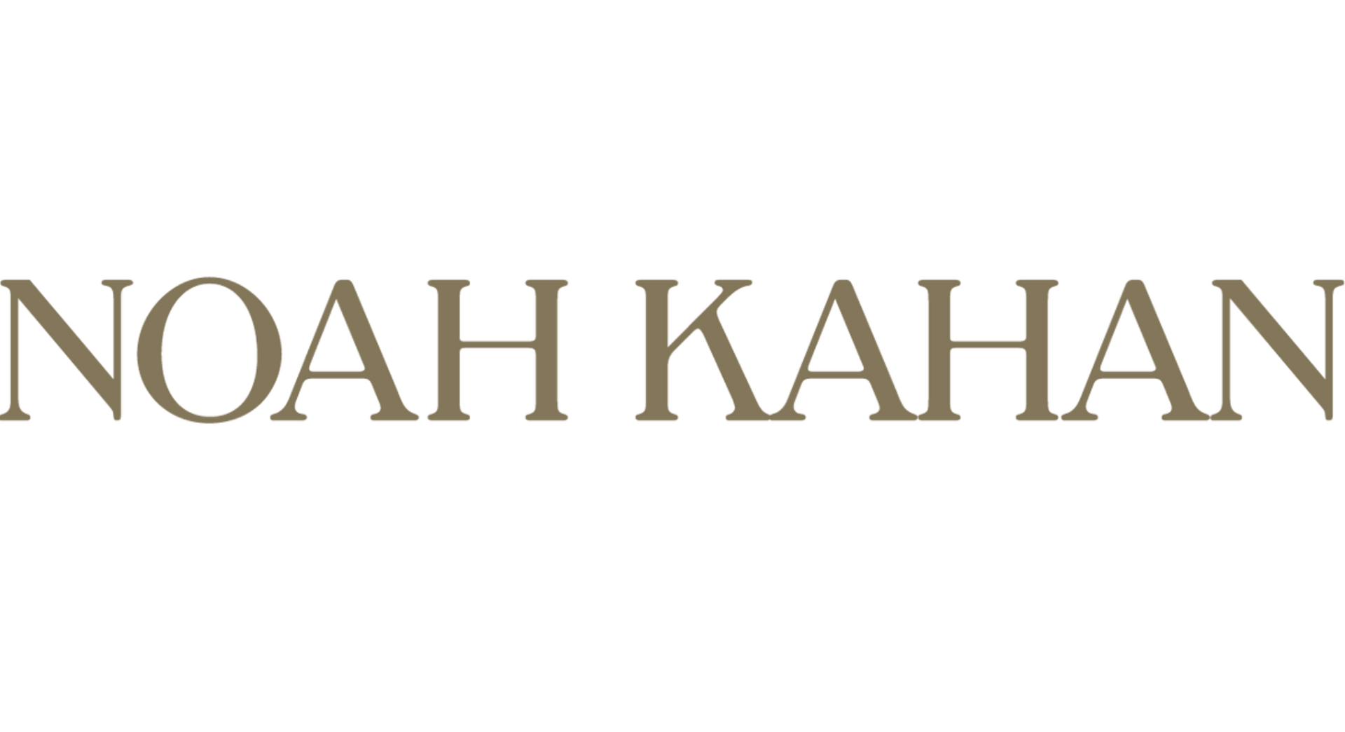
Noah Kahan Logo
Above: Posters and album covers of comparable artists that were the starting point for identifying current trends of design in popular artists within the genre.
SKETCHING
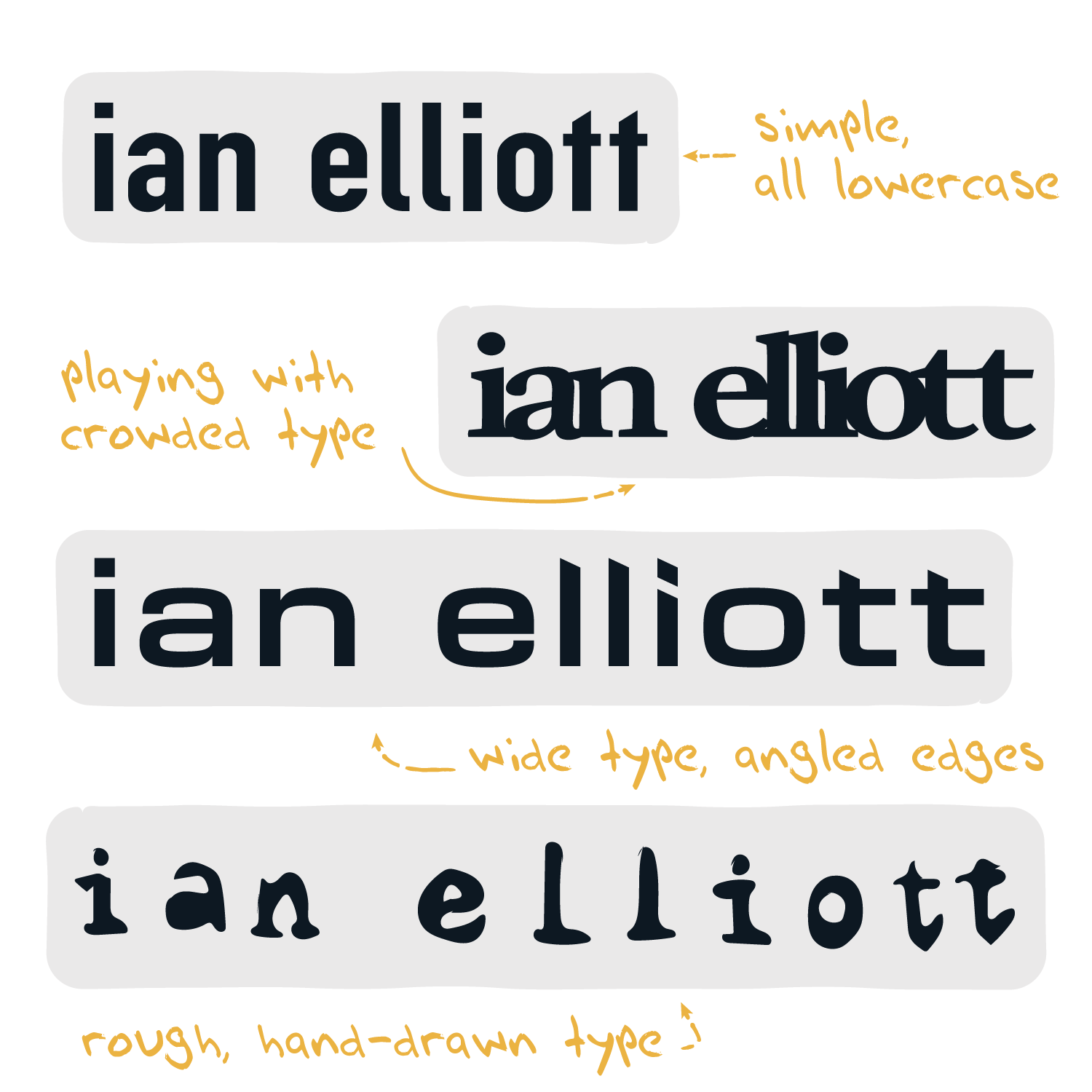
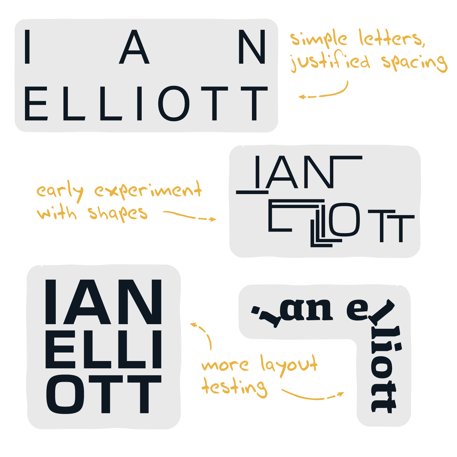
Spacing, Shapes, and Scalability
The beginning phase of this lettering design was the longest. Starting with common fonts, I began playing with spacing (should the letters be stacked? Left-aligned? Interacting or separate?) and shapes. Considering this name - Ian Elliott - has so many straight lines and edges, I wanted to see if, for one, the letters could fit under/into the letters next to them in a pleasing manner, and two, what kinds of shapes they could create. The client requested a font-driven logo without bells and whistles, but this stage of play is usually where I find a spark.
One thing I needed to remember while using various fonts, thicknesses, and distorted letters was that this logo has to scale. Whether it's on a big poster or on a CD, the legibility of the name is crucial - I can't make it intriguing to a fault.
ROUGH DRAFTS
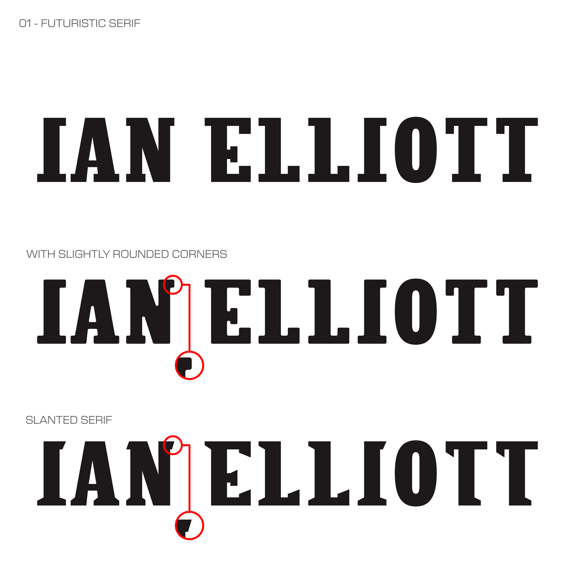
01 - Futuristic Serif
Version 01 is a sharp-edged, varied serif letter design. The custom letters were inspired by fonts that were thick but had large, sometimes overbearing serifs. Keeping these thick letters but applying quaint serifs - some altered/removed entirely to add to that indie vibe - makes the letters feel lighter, more approachable.
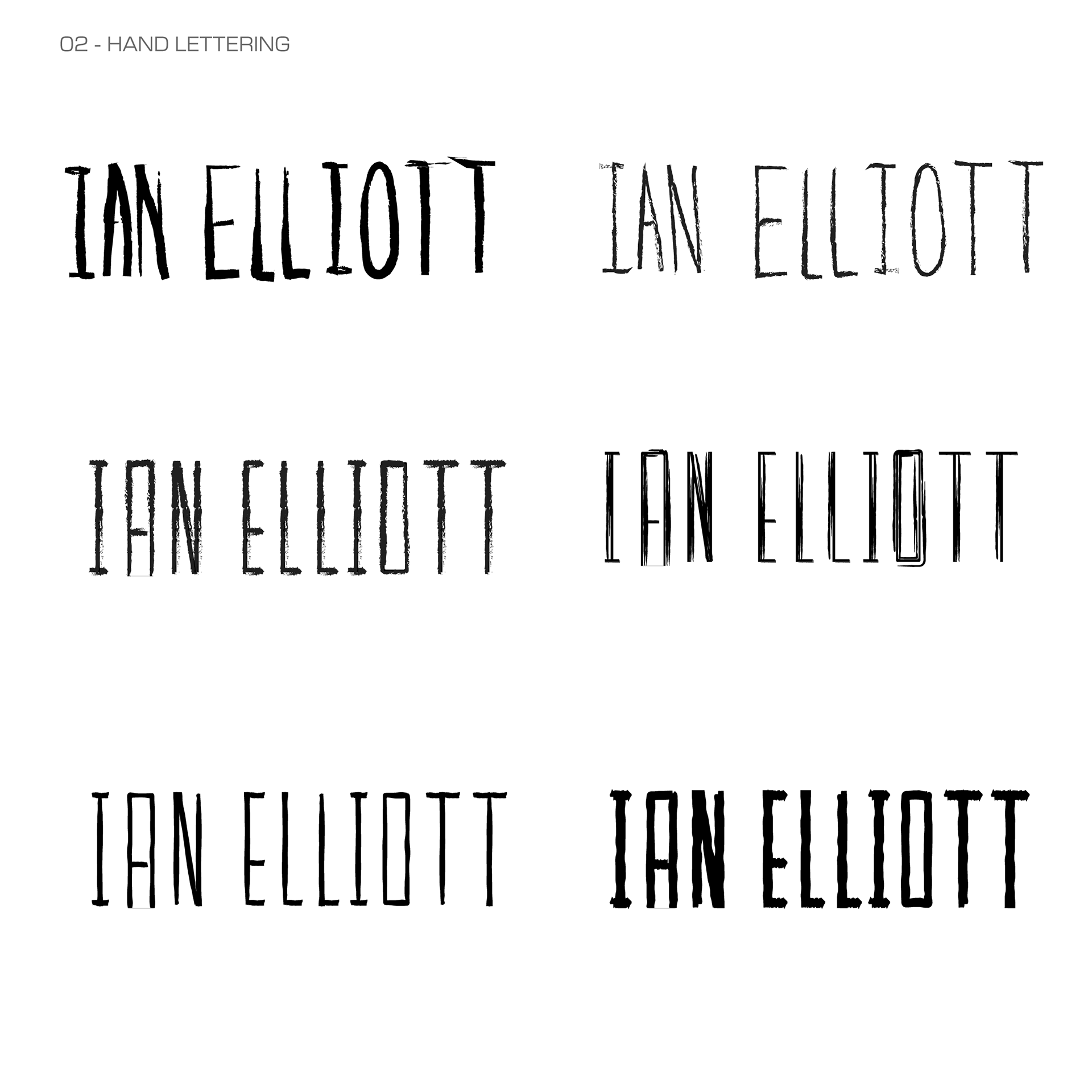
02 - Hand Lettering
Version 02 explores a hand-lettered, rougher look. The letters are tall and thin, maintaining a balance between aesthetics and legibility with the majority letters being tall and thin, as well.
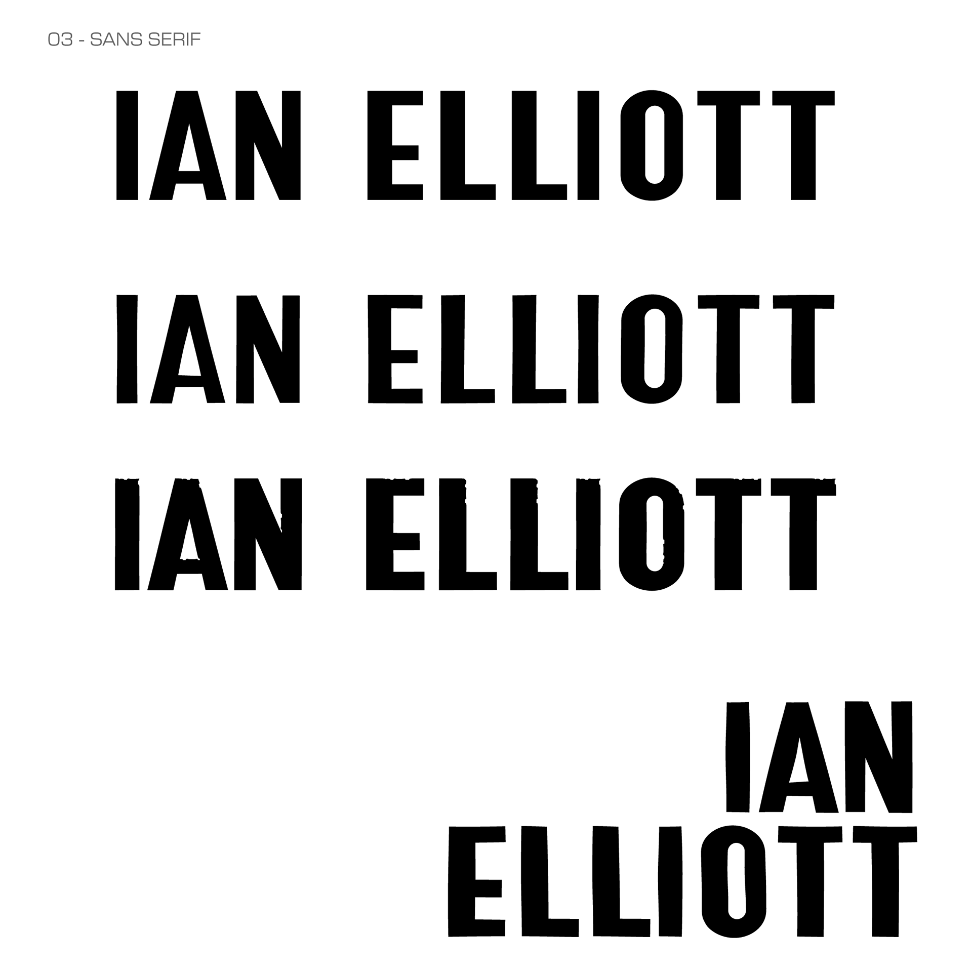
03 - Sans Serif
A condensed sans serif type with thick and thin lines and lower crossbars make up Version 03. This one has a slight retro vibe with most letters having both a thicker stem and thinner stem seen often in old jazz-related lettering.
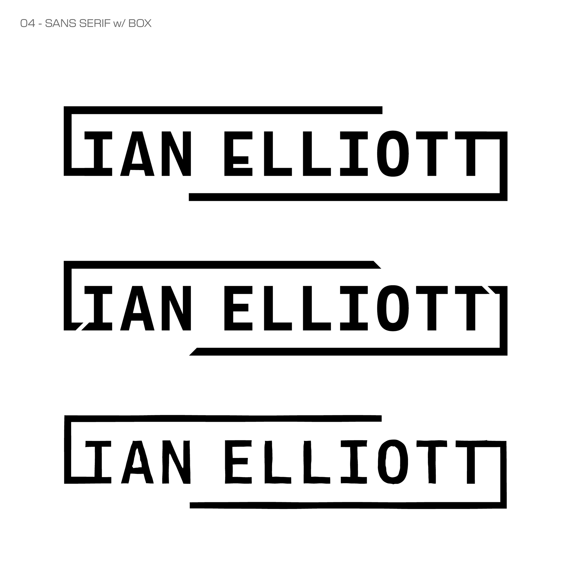
04 - Sans Serif w/ Box
Version 04 gets a tad busier than the previous versions. The combination of so many straight lines in the make-up of this name with this specific typeface inspired a semi-enclosed border that stems from the ends of the letters. Slight alterations like lowering/raising crossbars on some letters shown as well.
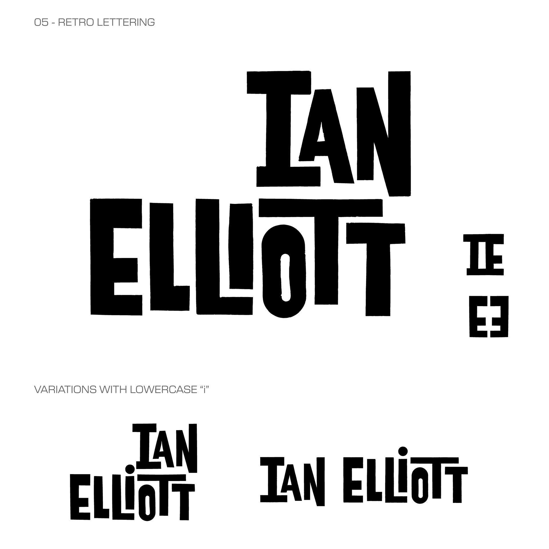
05 - Retro Lettering
Version 05 - the first one completed and my personal favorite - is a retro-inspired, thick sans serif type with varied spacing and manipulations. Each letter has been specifically stretched, thickened, and moved to fit to the letter next to it in a pleasing manner.
Variations on the design include one with the dot of the "i" in "Elliott" that sites nicely tucked next to the top row of the stacked letters as well as an in-line version.
Potential logos made from the "IE" initials are seen here as well, as the design of these letters create these shapes nicely (some other renditions of these letters did not work well in creating the "IE" or negative space logos based on crossbar position and thickness of letters).
FINAL CONCEPT
& DELIVERABLES
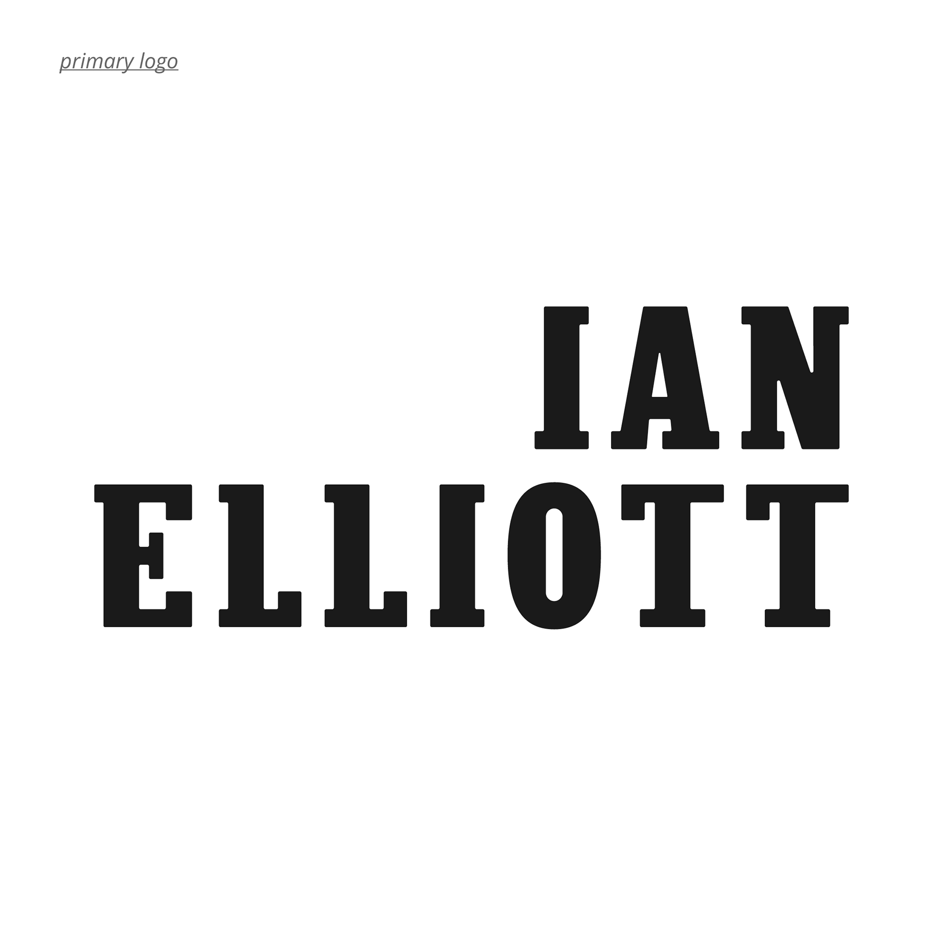
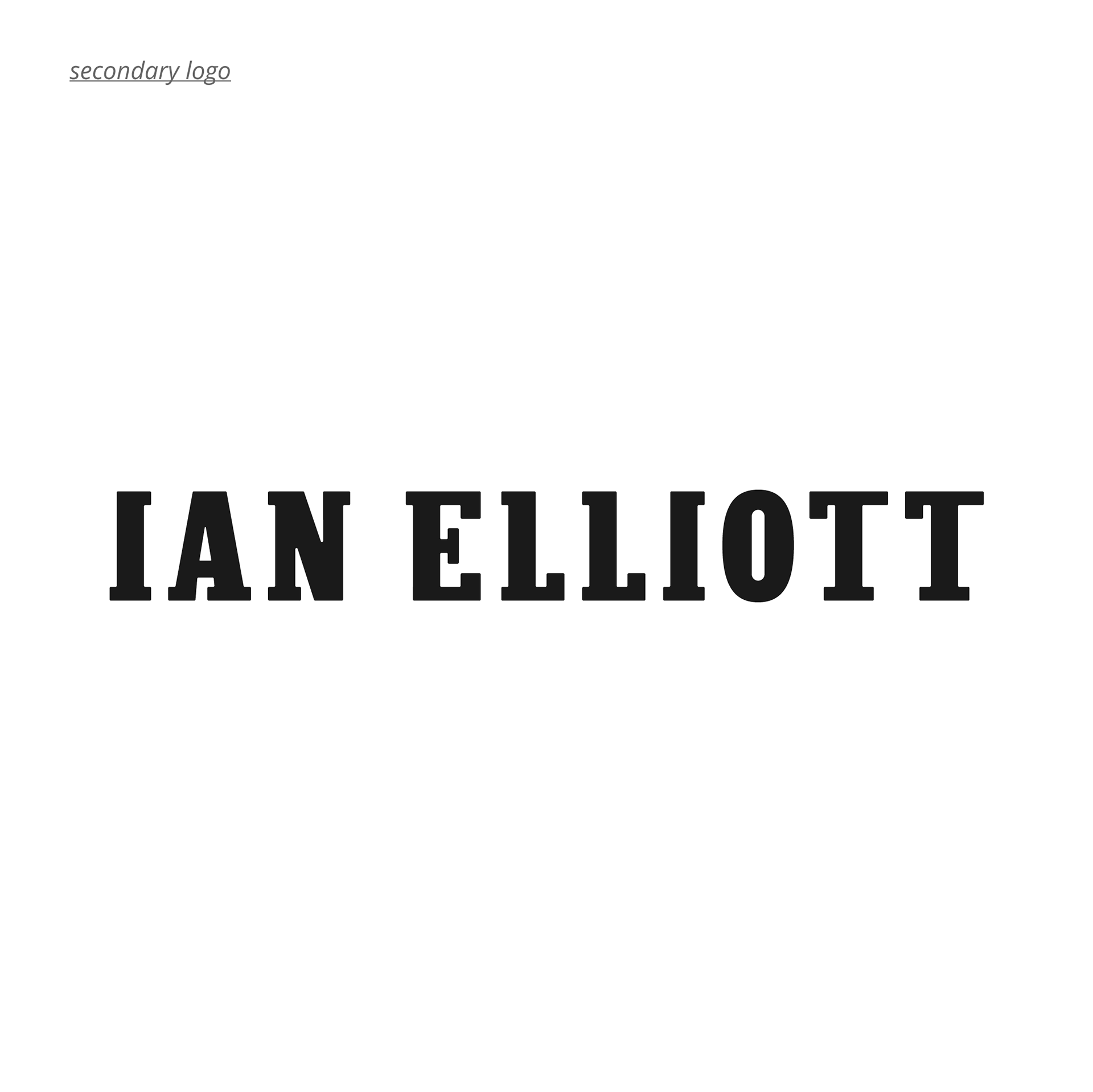
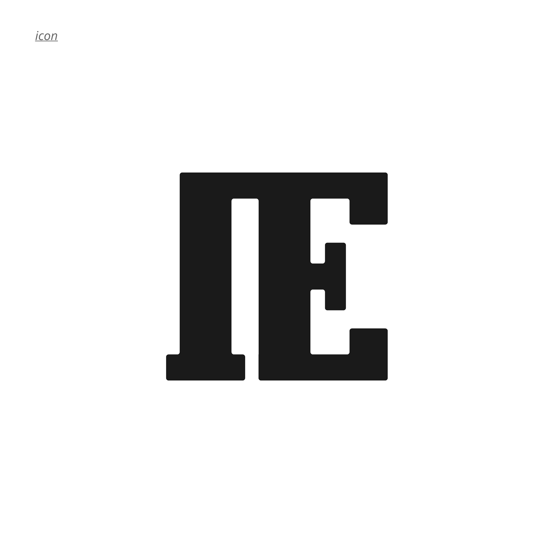
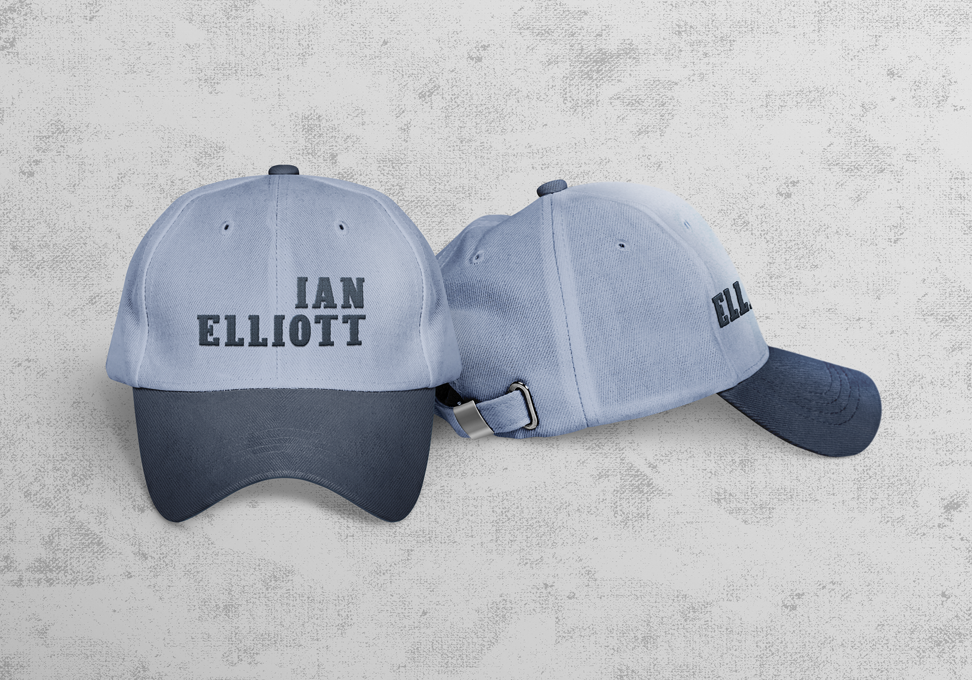
IAN ELLIOTT DELIVERABLES
Ian ultimately opted for Version 01 - Futuristic Serif. The main logo is stacked, right aligned with the corners of the letters slightly rounded, eliminating the harsh edges and bringing a softer, lighter feel to the type. The emblem made of the "IE" initials is also seen here. While Version 05 included two versions of the emblem, this specific type did not allow for the double "E" and negative space "I" emblem to work due to the serifs.
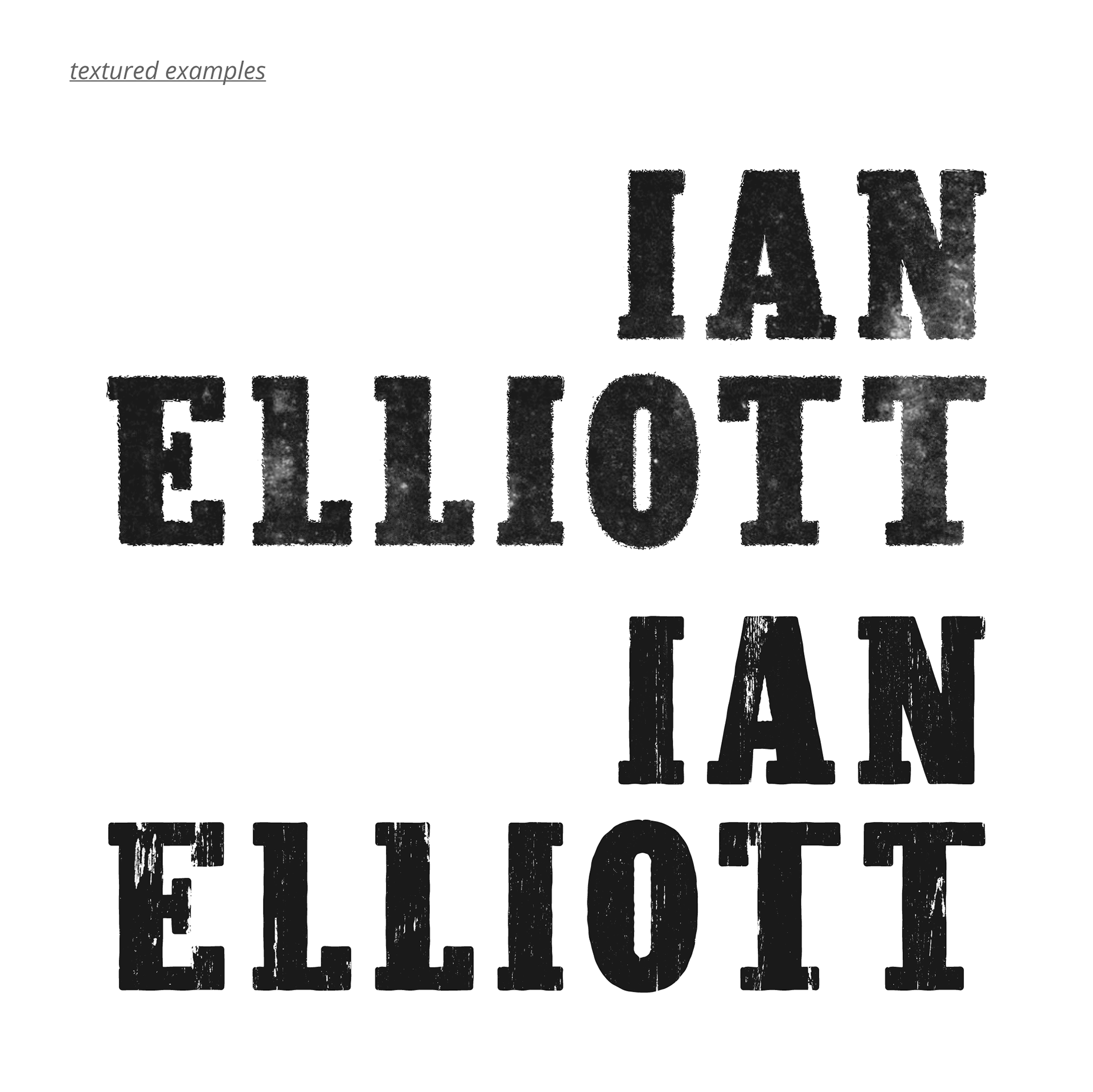
ADDITIONAL MATERIAL
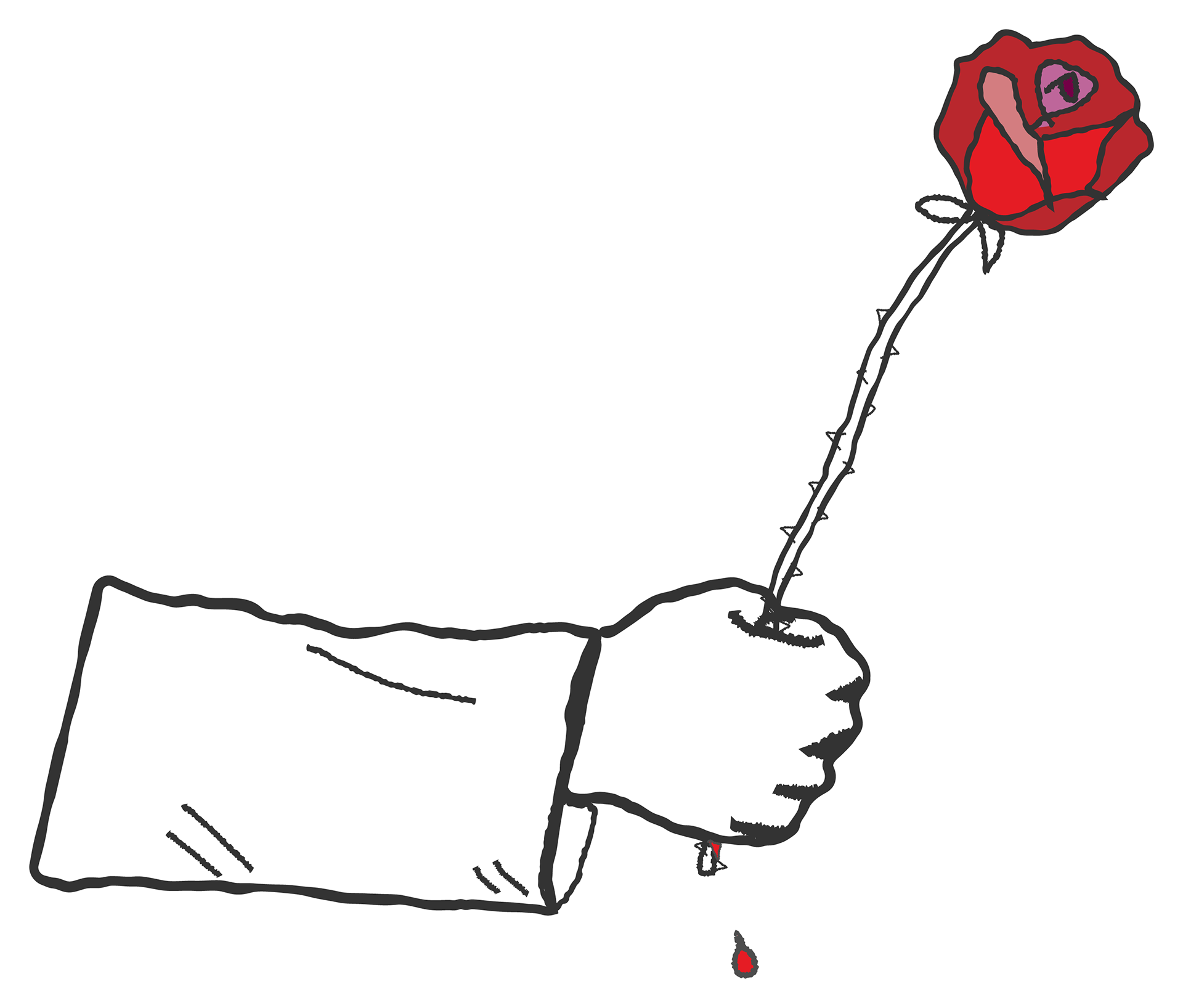
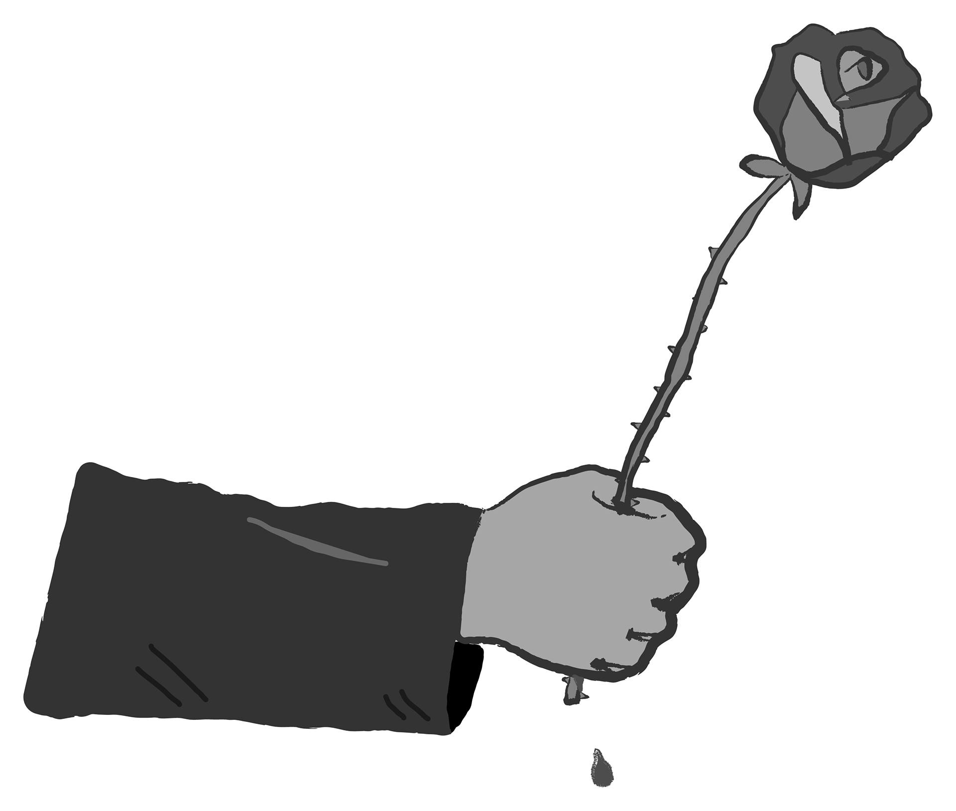
Inspired by the imagery in Ian's recent music video (with a common theme of hands holding flowers and how painful love can be), I created an emblem of a hand holding a rose that's dripping blood from the thorns to use on some mockups. This emblem - sometimes shortened to just the head of the rose - became a great visual for Ian's identity. "A strong hand clasping a flower" is a perfect encapsulation of Ian's identity; strong but tender. Above are different variations, one only outlined with the rose in color and another in grayscale.
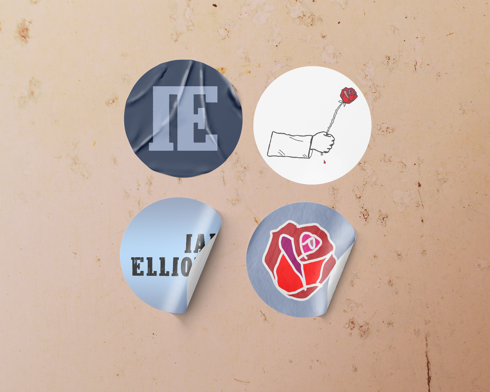
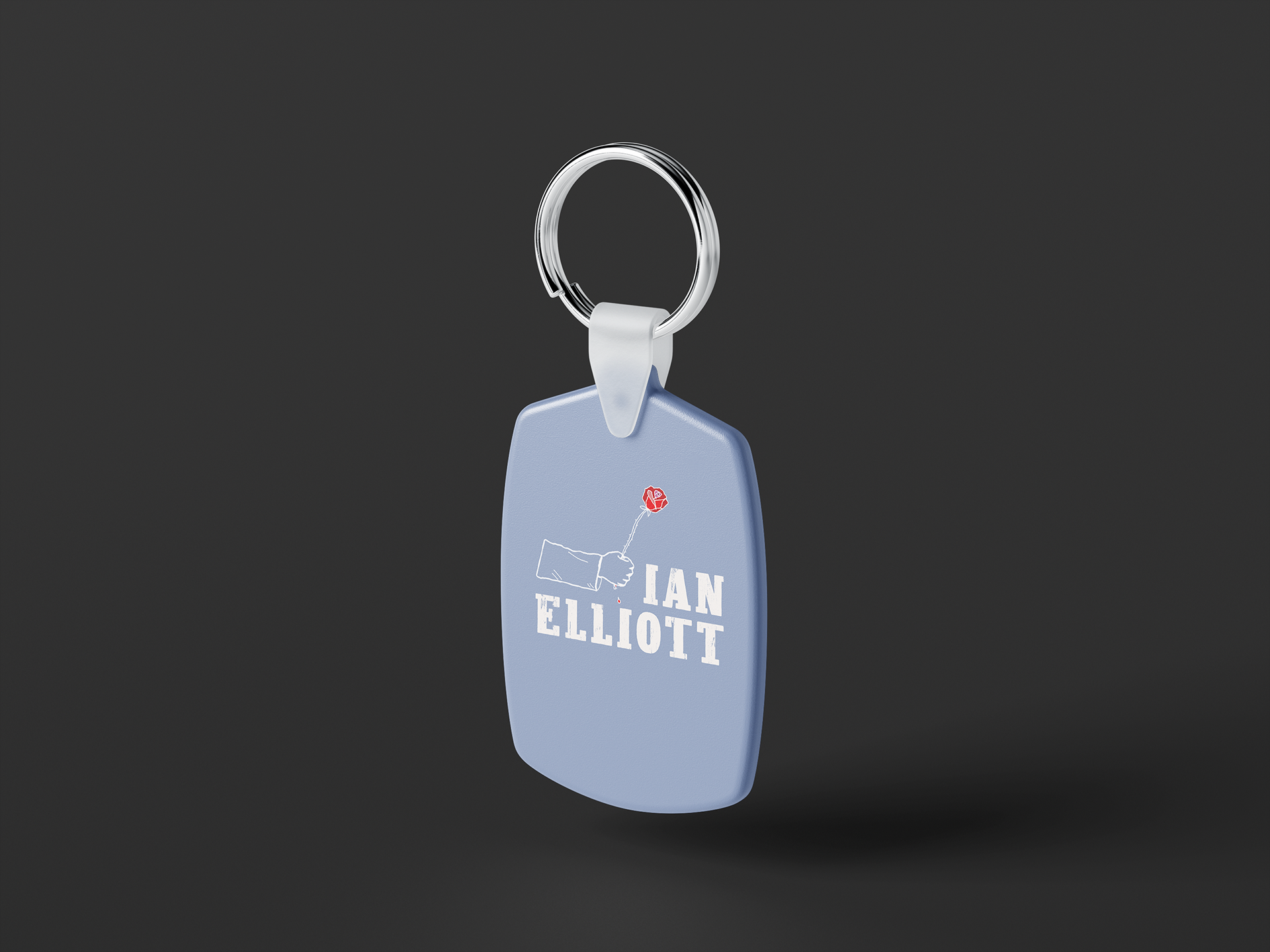
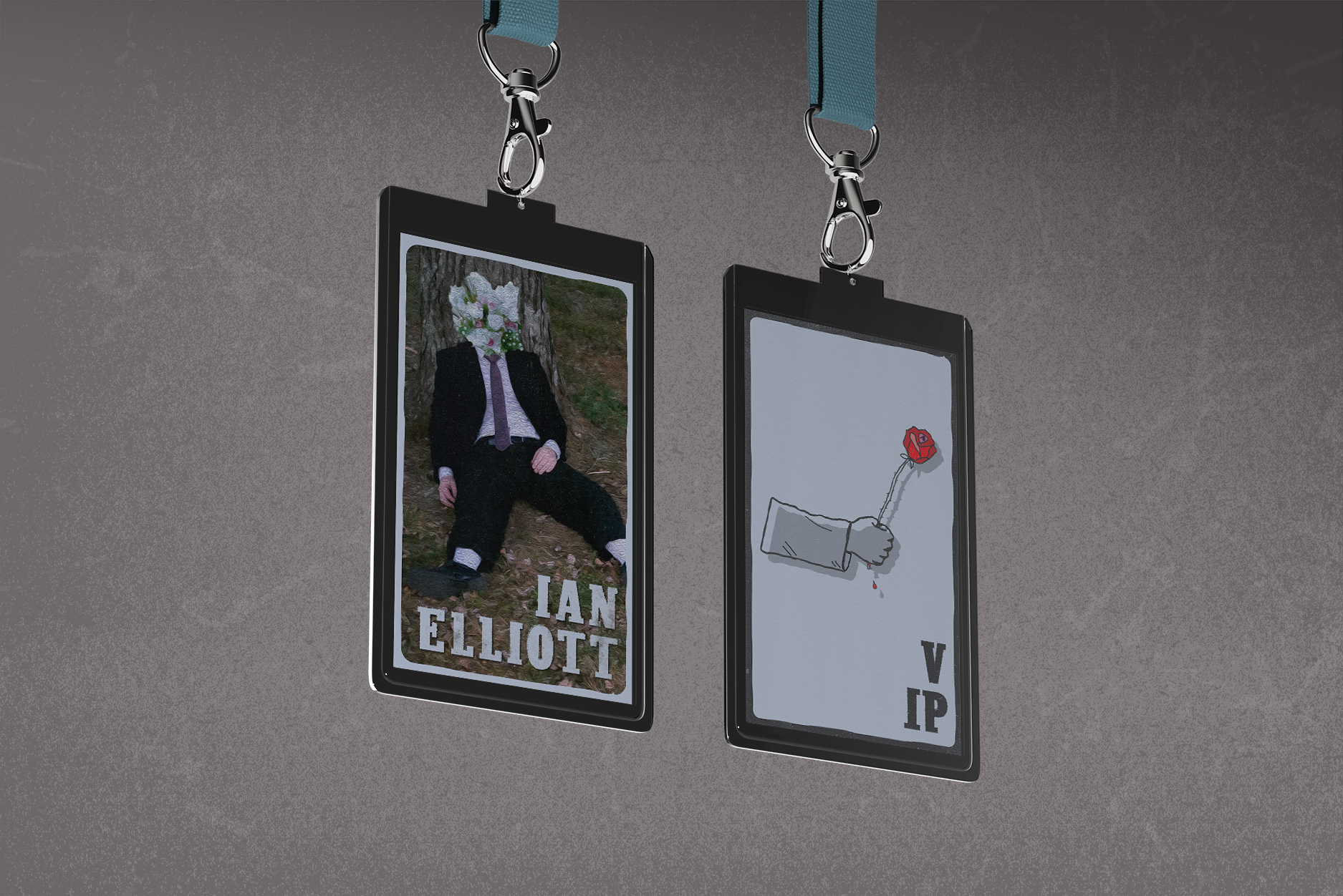
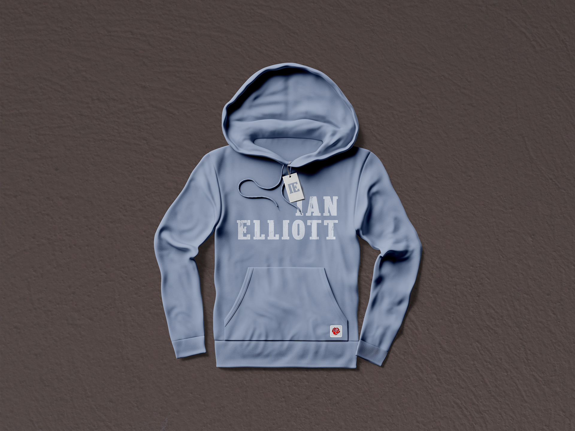
Above: various branding mockups including both the type design and emblems.
Photo of Ian Elliott shown on badge mockup courtesy of the artist.