The Door That Isn't There
Short Film Poster
Synopsis: A man wakes up in a flat he doesn’t quite recognize, with a flatmate he is not sure he knows, and a black door that seems to disappear when you look at it directly.
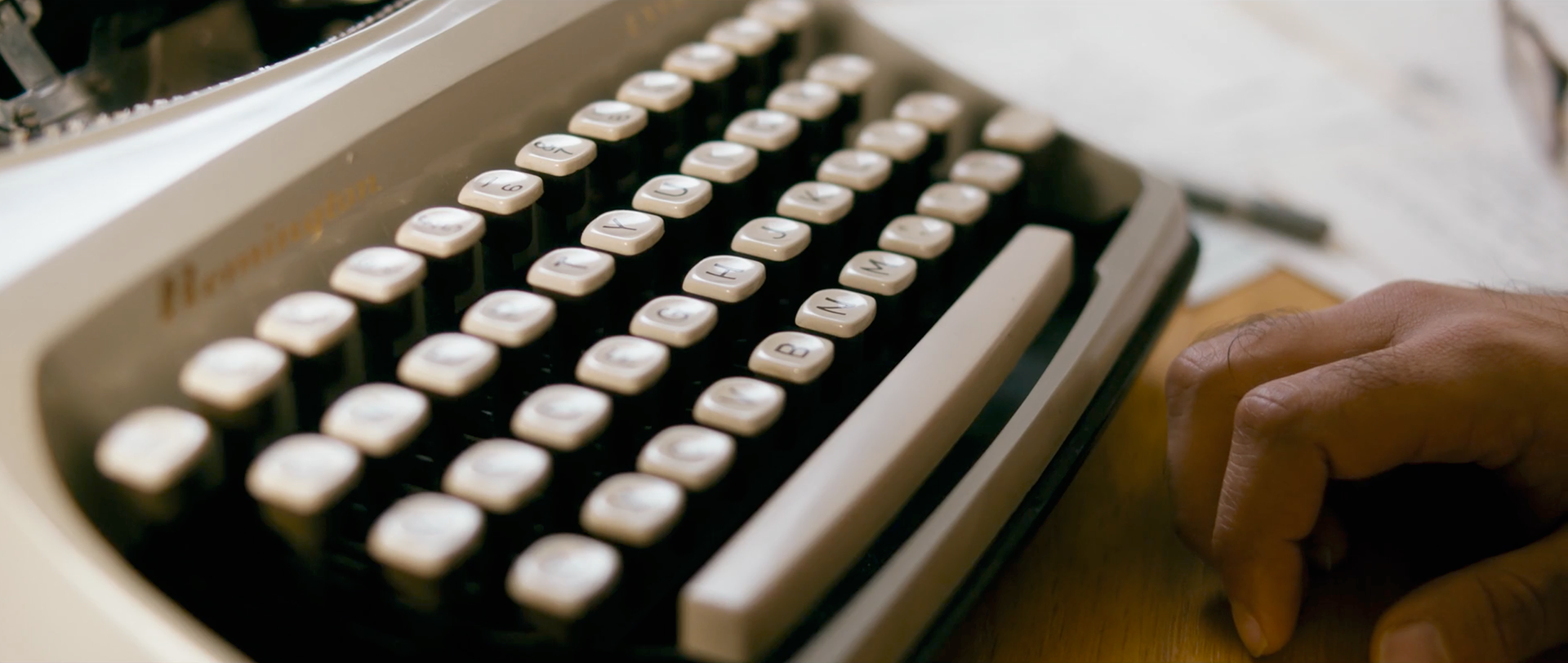
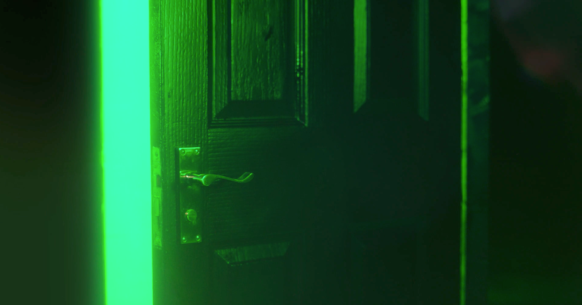
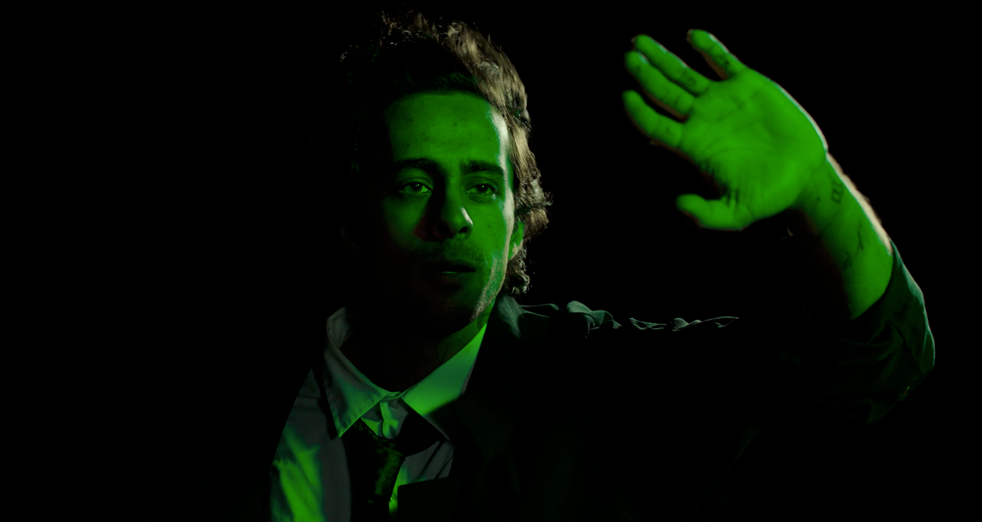
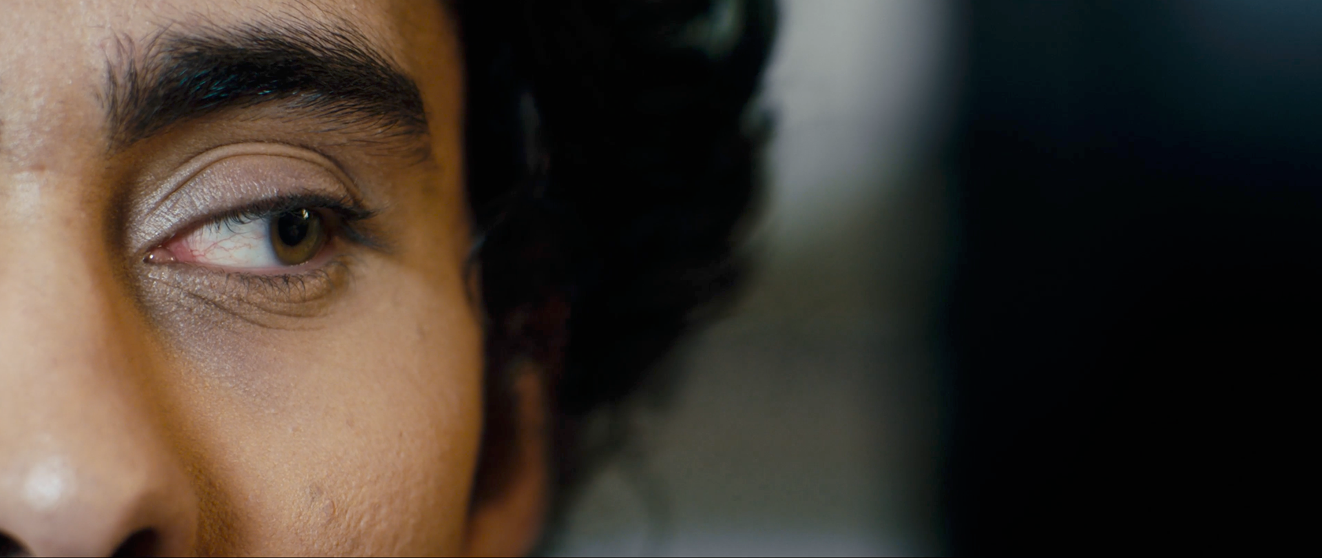
Above: Film stills that helped in identifying the style, color palette, and important subject matter for the poster.
Rough Concepts
Creating the poster for this film ended up requiring a lot of trial and error. This project required a poster that would work in both portrait and landscape - a difficult task in both composition and legibility. The scope of the project wouldn't allow me to create two entirely different posters, so being able to mold a single concept into two different shapes would be the most trying part of the design process.
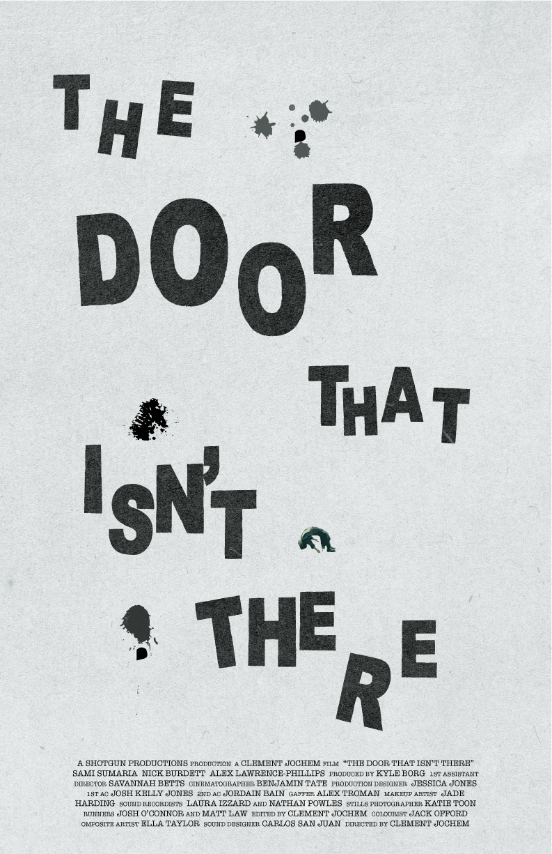
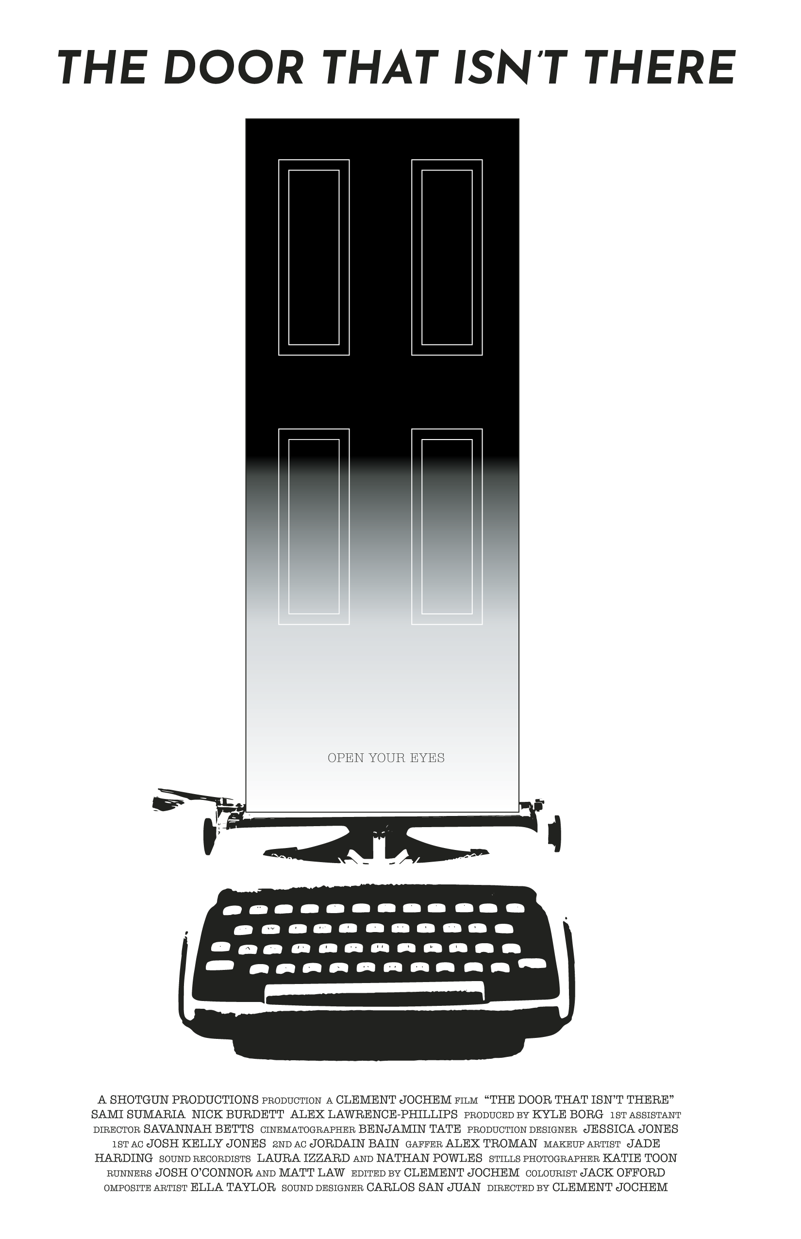
Rough 01 - "Open Your Eyes"
This poster is based off of a piece of art featured in the film that's created by the main character on a typewriter while in a fugue state. This piece was the one I pitched as the best concept for the requirements at hand and felt most confident in, featuring a strong concept that was also easy to reconfigure onto either portrait or landscape.
The portrait and landscape versions are slightly different, one showing a version without ink splotches and one with. The ink splotch version also includes a small image of the main character, David, from a climactic moment in the film. In the final version he would be more hidden away, like an easter egg for someone who has previously seen the film. For this concept art, he is more easily viewable to someone who knows that he's there.
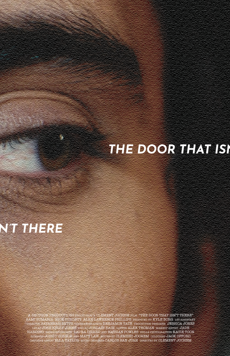
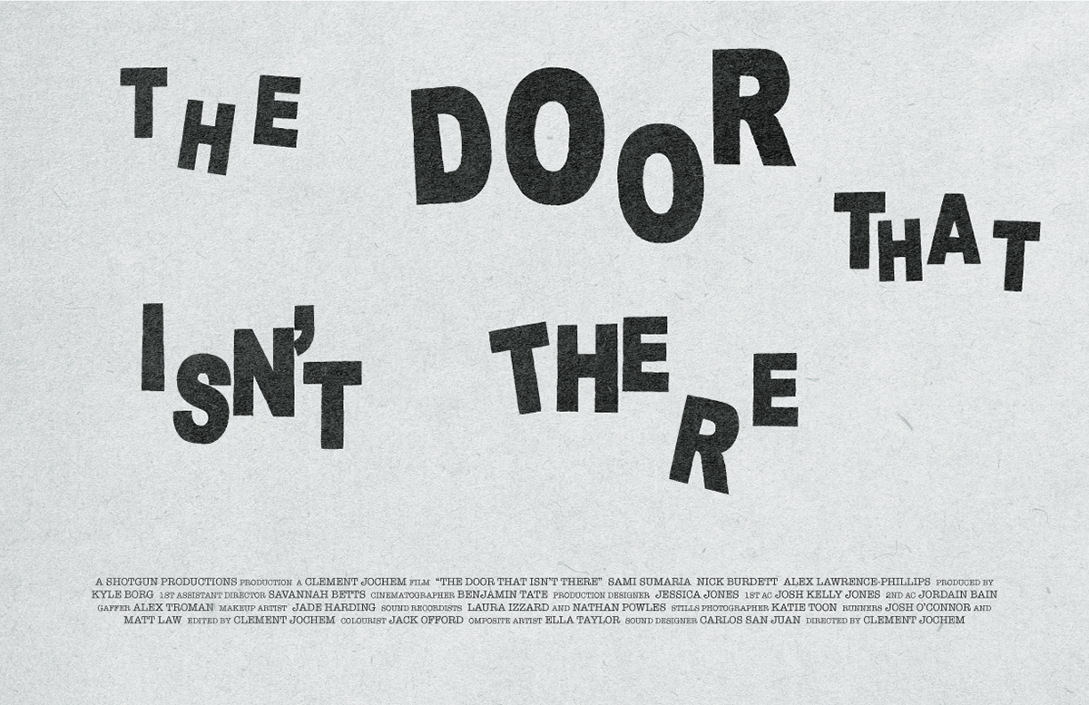
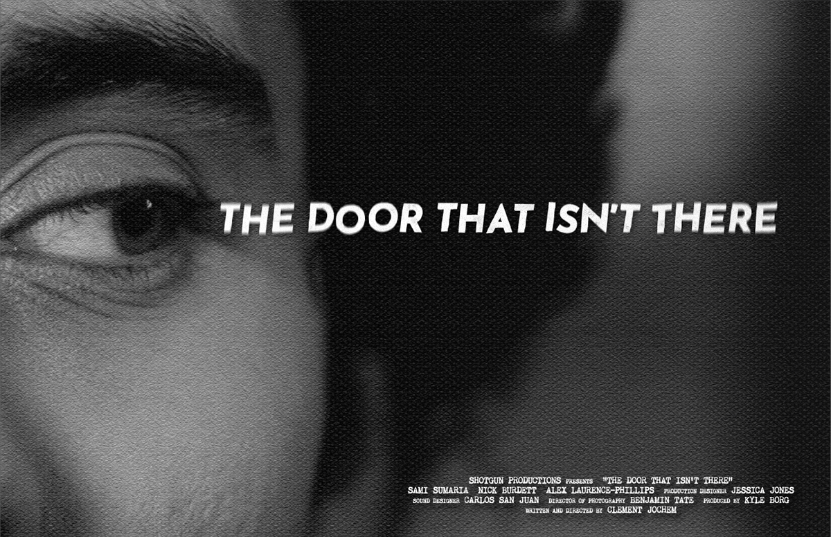
Rough 02 - "Corner of Your Eye"
This concept features a still of David looking out of the corner of his eye at the door where it then meets directly with the title.
Trying to convert this idea into both a portrait and landscape was tricky and required a different type treatment when moving from poster to poster; the full title would fit fine on landscape, but on a portrait orientation it would either fall off the page or be too small. For the concept pitch I split the title in two and placed the second half of it just below David's eye, coming from the other side, as though nowhere is safe for him. This same concept would not work on the landscape version as it required the title to be too large, overtaking the image of David and entirely changing where the weight of the image sits.
Rough 03 - "Write"
This idea was included in my pitch as a portrait oriented poster only, and thus it was the least fleshed out of all the concepts. I knew the concept was strong enough that it could very well be the favorite, and if it was then it would need to be decided by the client whether or not having a landscape poster in addition to the portrait version was a necessity in this case. A very simple color palette - white, black, and some green - would be in the final version.
A tagline of 'Open Your Eyes' (a reference to a scene from the movie) is featured on this poster as text written at the bottom of the page.
Feedback
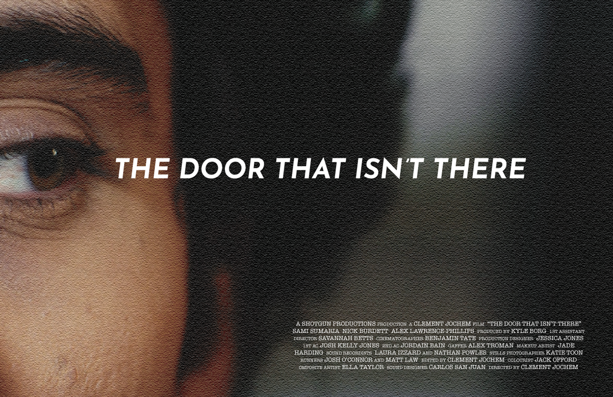
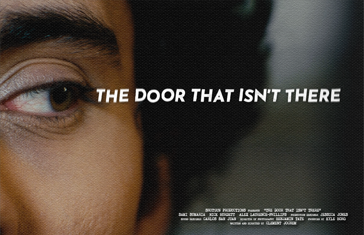
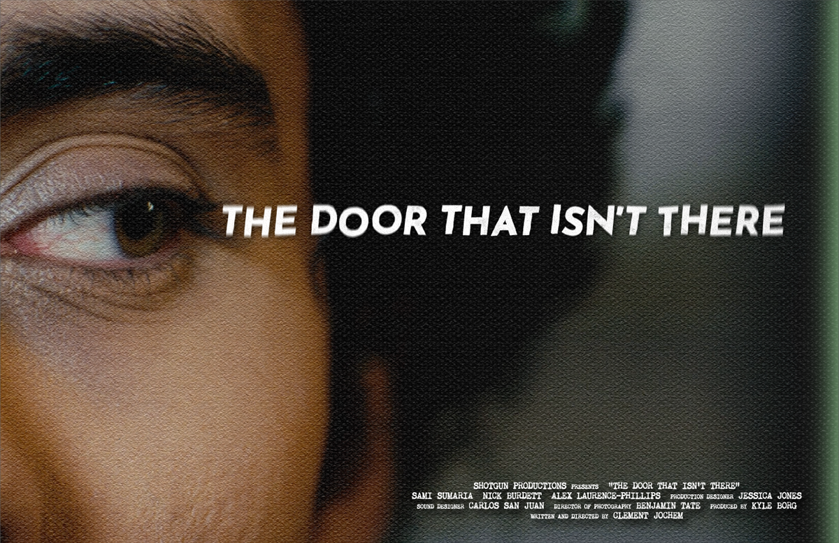
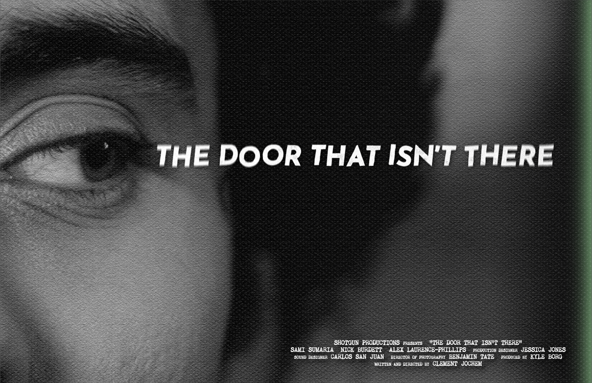
The immediate response to these concepts was that Rough 02 - "Corner Of Your Eye" was the winner, keeping the different title treatments as is. Following this, I created different versions of this chosen concept, including a grayscale version and ones with a green glow coming from the right side of the poster. Ultimately it was decided that the original concept - color, no glow - was the winner (versions shown below in landscape).
FINAL
The final version required some light touch-ups on Photoshop to remove minor blemishes on the cheeks, some bags around the eyes (not all), and shaping of the eyebrows. The title has minor crooked lettering with a slight radial blur effect - on theme with David's constant confusion and his life seemingly going in circles. The credit block features a typewriter typeface and some canvas textures are placed on the poster to give it a human feel.
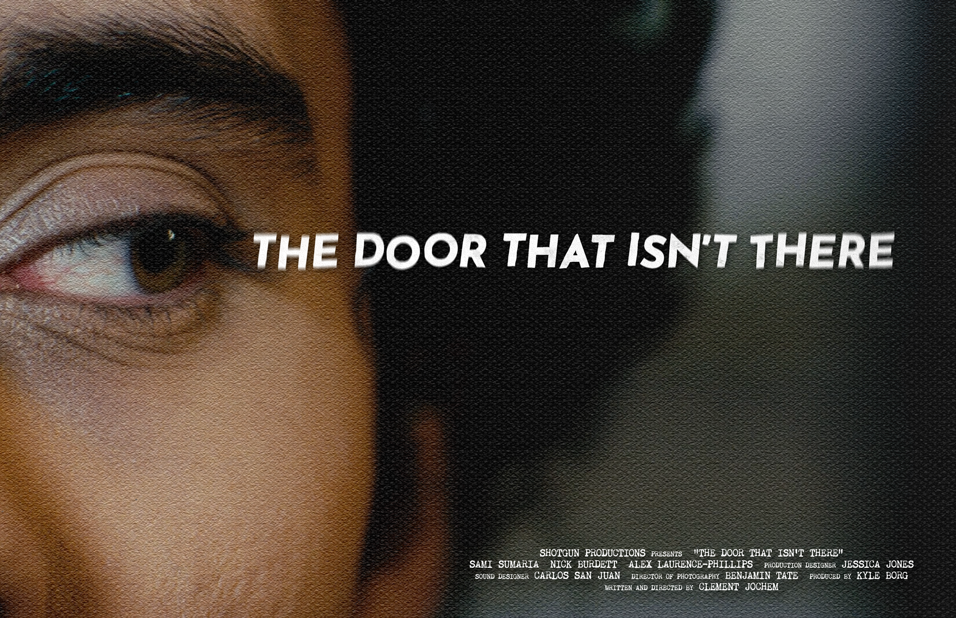
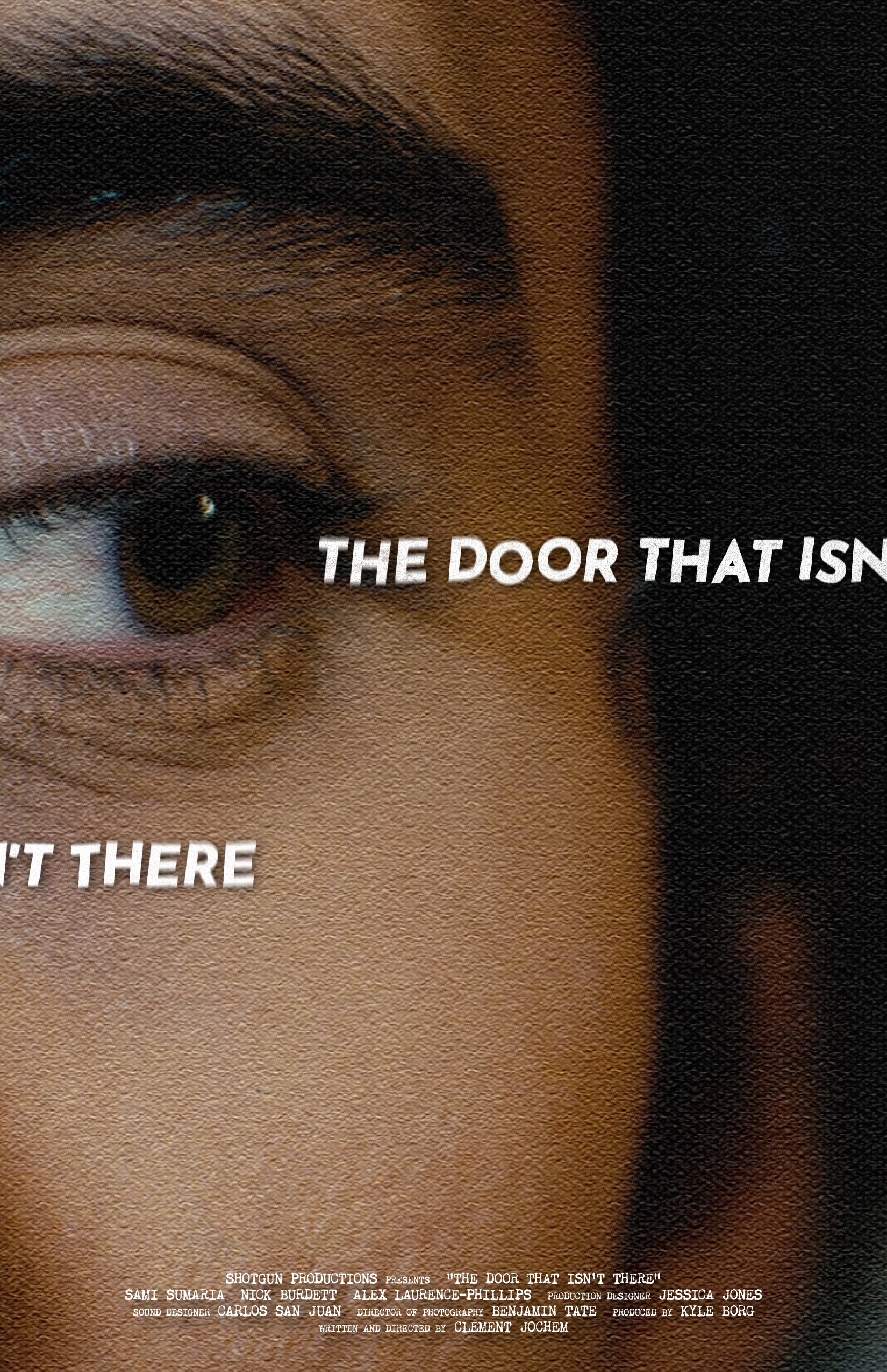
Above: The Door That Isn't There final poster designs.