Jason's Piano Tuning
Branding
A local piano tuner looking for an update on his minimal branded materials.
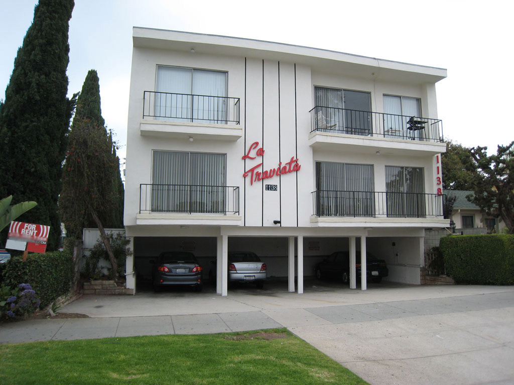
Dingbat Apartment Building
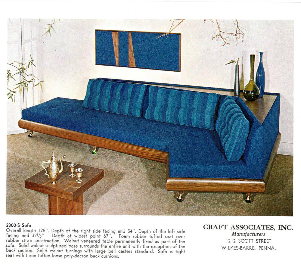
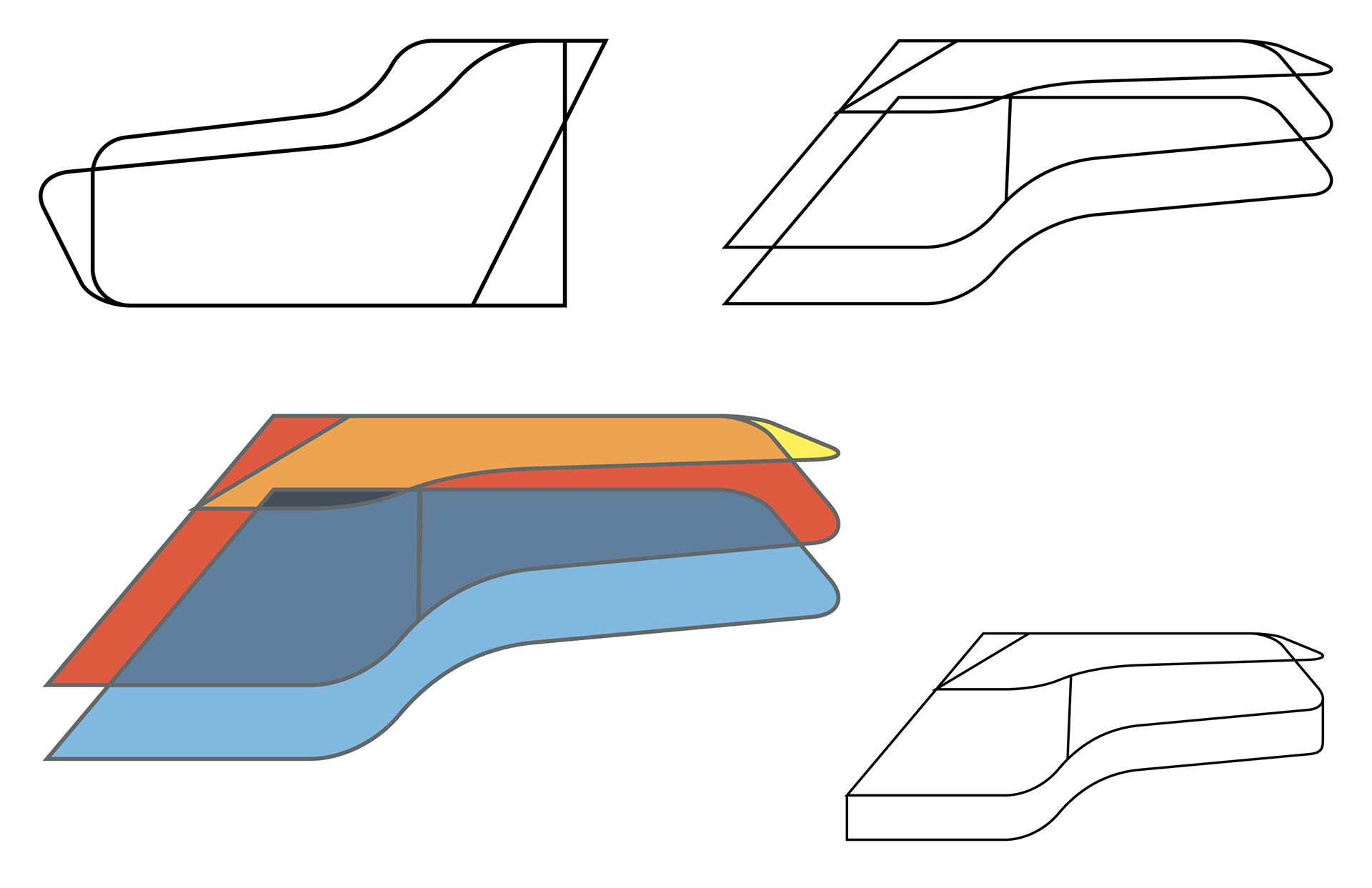
Adrian Pearsall's Boomerang Sofa
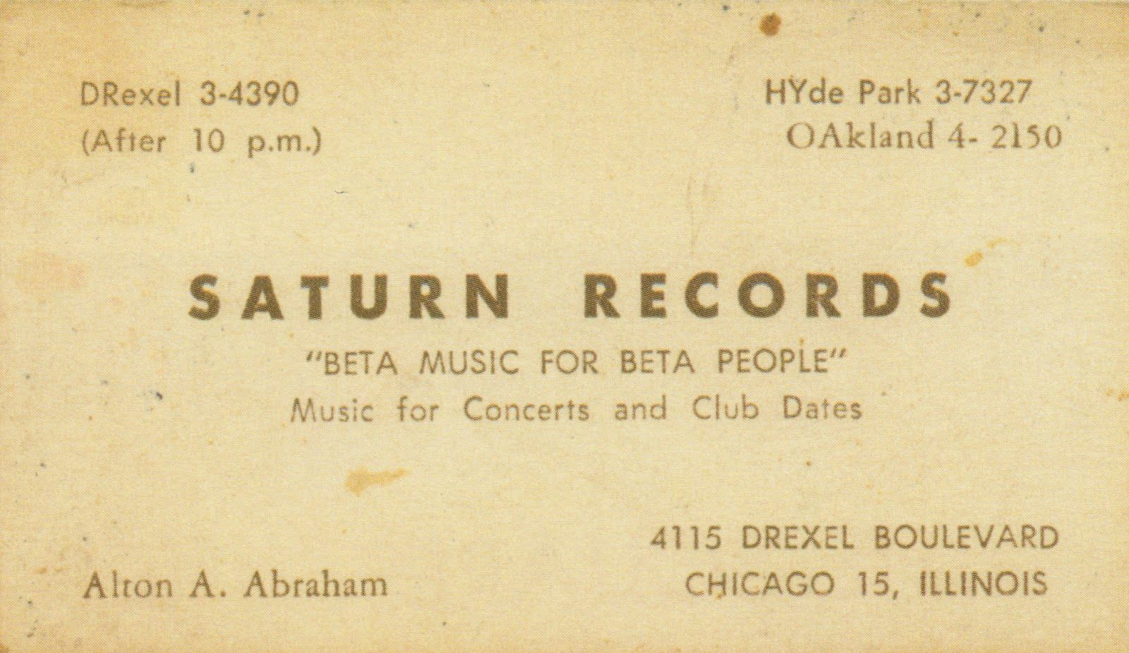
Mid-Century Business Card

Atomic Age Patterns
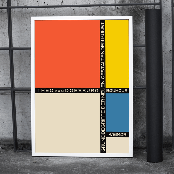
Bauhaus Poster
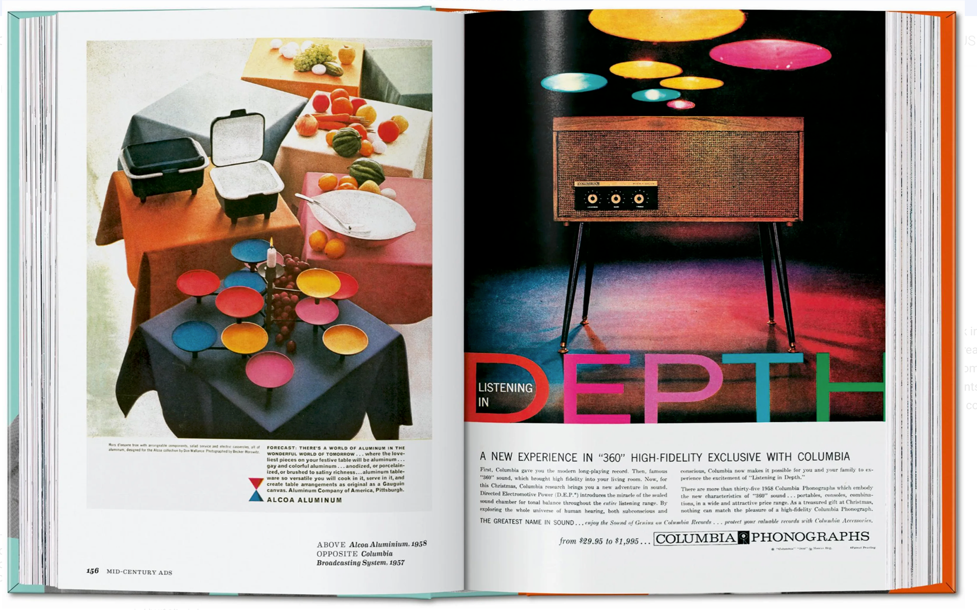
Colorful Mid-Century Ads
Above: Images that would inspire the final logo and other deliverables in era, palette, and shape.
CREATIVE BRIEF
This client is a one-man operation, tuning pianos as a side gig only a handful of times a year. His clients are mainly people he already knows or those who have been referred through those original clients. With no online presence - and no desire or need for one - the main things required for this project are updated business cards (goodbye 20 year old clip art!) and invoice templates.
SKETCHING
Phase 01 - Outlines
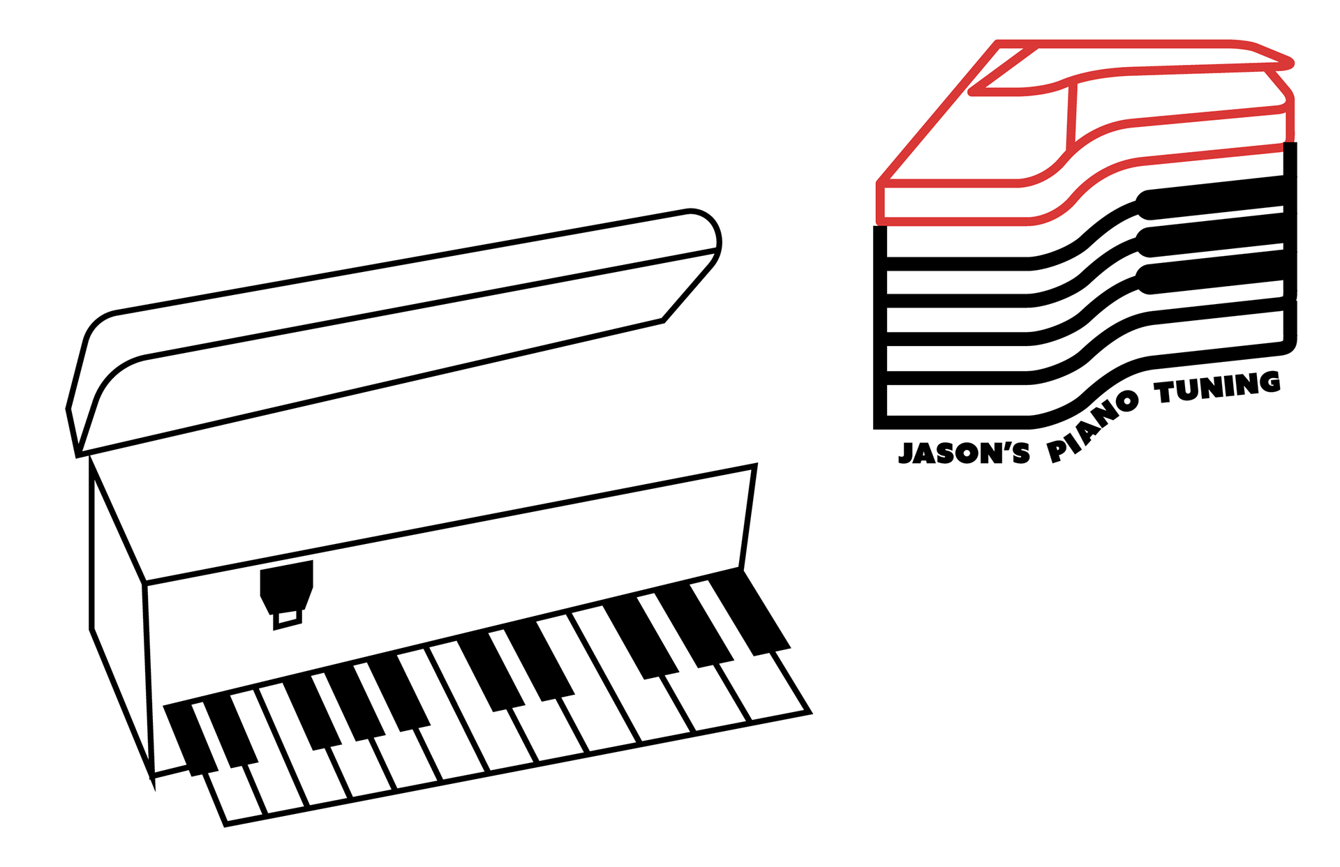
The sketching phase of this project was a whirlwind. I started with a simple outline of the lid of a grand piano - luckily as a longtime pianist I'm very familiar with the instrument - and started skewing and layering these outlines to see if something abstract would stand out (heavily inspired by the concepts behind the MIT Press logo by Muriel Cooper and the MIT Media Lab logos by Pentagram). I started coloring in layers to study how they interacted and what new shapes they created together.
Phase 02 - The Toolbox
Getting stuck with the outlines, I decided to pivot to an idea of having a piano tuner's toolbox as the body of the piano since both objects have lids that lift upwards. During this process I also started to look at the piano keys more, running them sideways or vertically, but overall these concepts ended up seeming a bit too complex and didn't seem to match the client's personality.
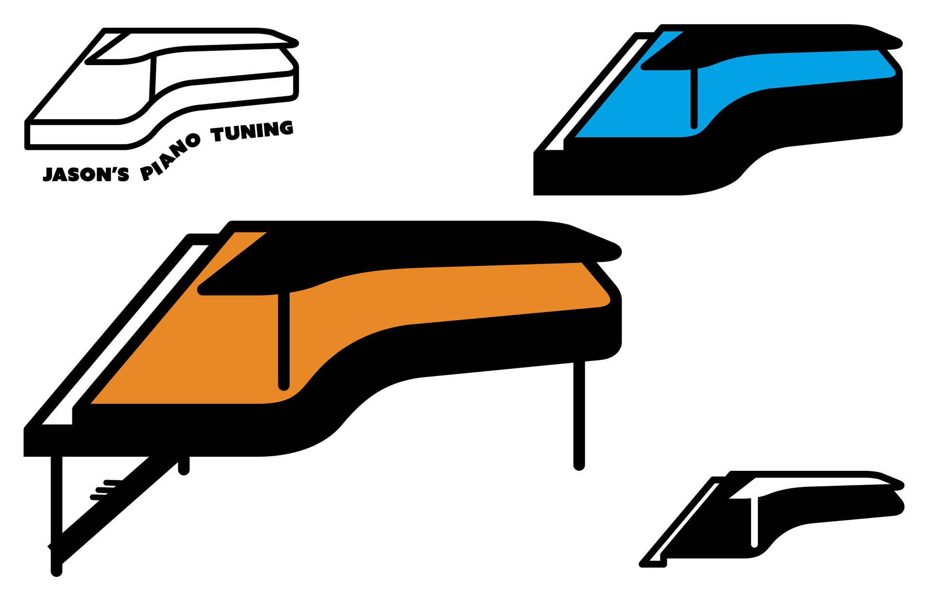
Phase 03 - Simplification
I had really liked the general idea and impression of the original outlines and decided to revisit them. I noticed this time that the lid of a piano resembled a boomerang - a popular design icon from the Atomic Age of the mid 1900's.
Everything clicked into place.
The feeling I was now aiming for was a reference to the 1950's to 1960's. This client was born in this era and grew up in a house with a lot of the adornments of the Mid-Century Modern, Bauhaus, and Atomic Ages. This logo is going to be created from clean lines, a simple color palette, and a little bit of abstraction. I started building these outlines out a bit more and realized why I had struggled with creating conceptual shapes at the beginning: In order to go abstract I was going to have to start from a solid, more realistic base and remove ideas from there.
I would add areas (like the solid black siding of the piano or the legs and pedals) only to remove them again when it became too muddled. I started playing with color at this stage as well to see not only if one color could really make the idea pop, but also where exactly the color should start and end.
Another reference I pulled from this time period was the dingbat apartment buildings from the 1950’s and 60’s. These buildings have clean lines and solid colors - mainly white or gray with one pop of color (but can be more intricate in both areas). The simplicity of these buildings along with the typefaces usually associated with them (cursive in color) were the exact setting I imagined this logo taking place in.
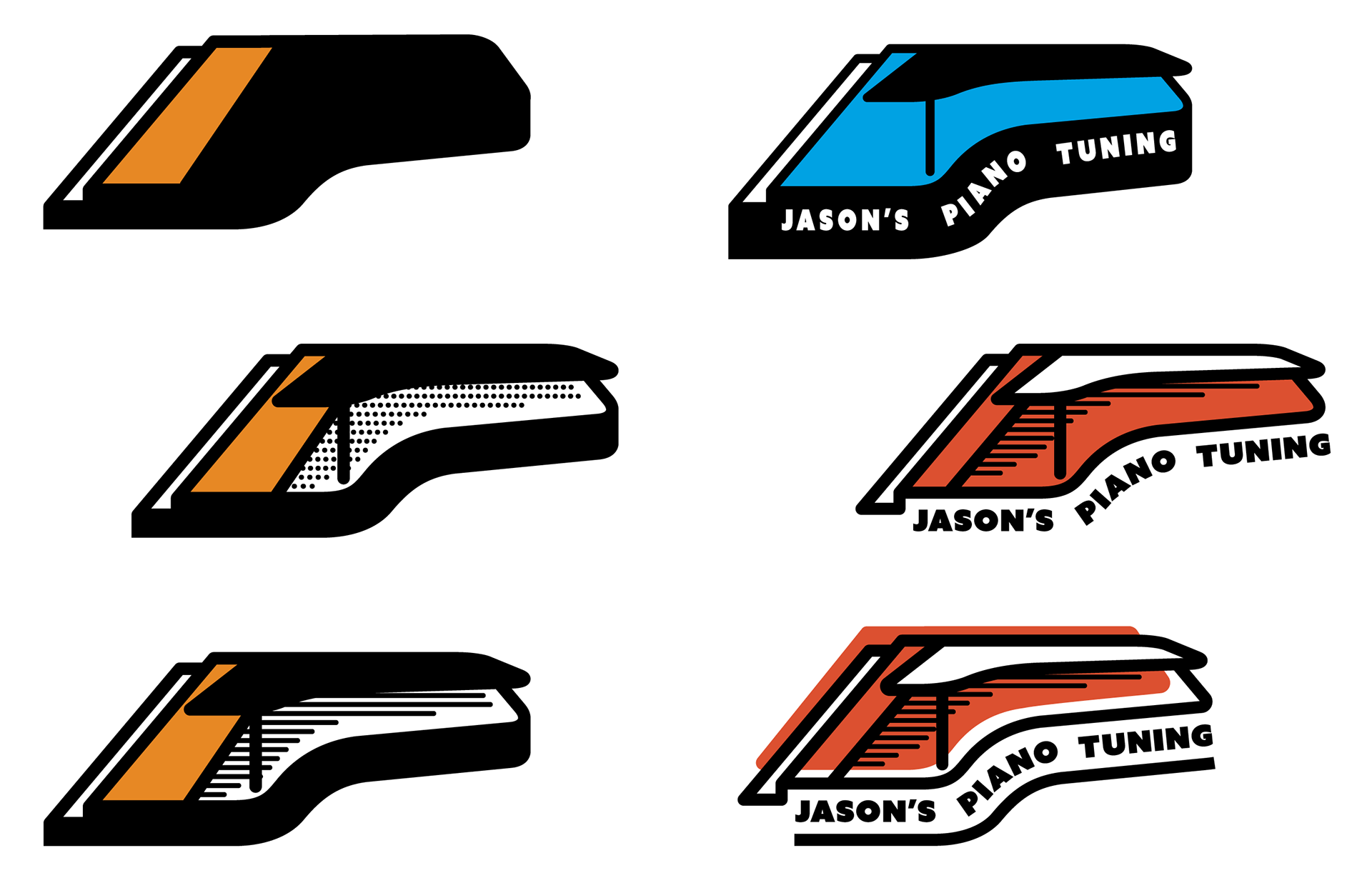
Phase 04 - Last Looks
I had settled on the main shape - a sideview of a grand piano. Versions with the lid closed seemed too simple and bare, but the open lid begged for some detail on the inside. I played around with adding color and adding lines or dots to represent the piano wire. The straight lines with rounded tips that didn't meet all the way to the edge of the piano really gave a vintage feel to the logo but didn't make it feel too busy or overly complicated.
Finding the ideal location for a splash of color and the best way to fit the text around the logo was a great exercise in trial and error. A nice light blue - although era appropriate - gave an impression that the shape was actually a swimming pool, not a piano. The first color I used in sketching - a nice, vibrant orange - stuck with me from beginning to end.
I had decided early on that the text would fit best around the bottom of the logo, but it needed more attention at this stage; should it follow the curve of the piano? Should it have a line underneath to signify the bottom of the piano, or should the text itself read as being the side itself? These areas, again, required testing, reshaping, and most importantly, time away to regroup and see it with new eyes.
FINAL CONCEPT
& DELIVERABLES
Having a design that had a beginning and ending with such a clear connection between each can be a great feeling; my gut instinct on style and subject paid off well in the end to create not only the best logo for my client, but business cards and invoice documents that matched their personal aesthetic as well.
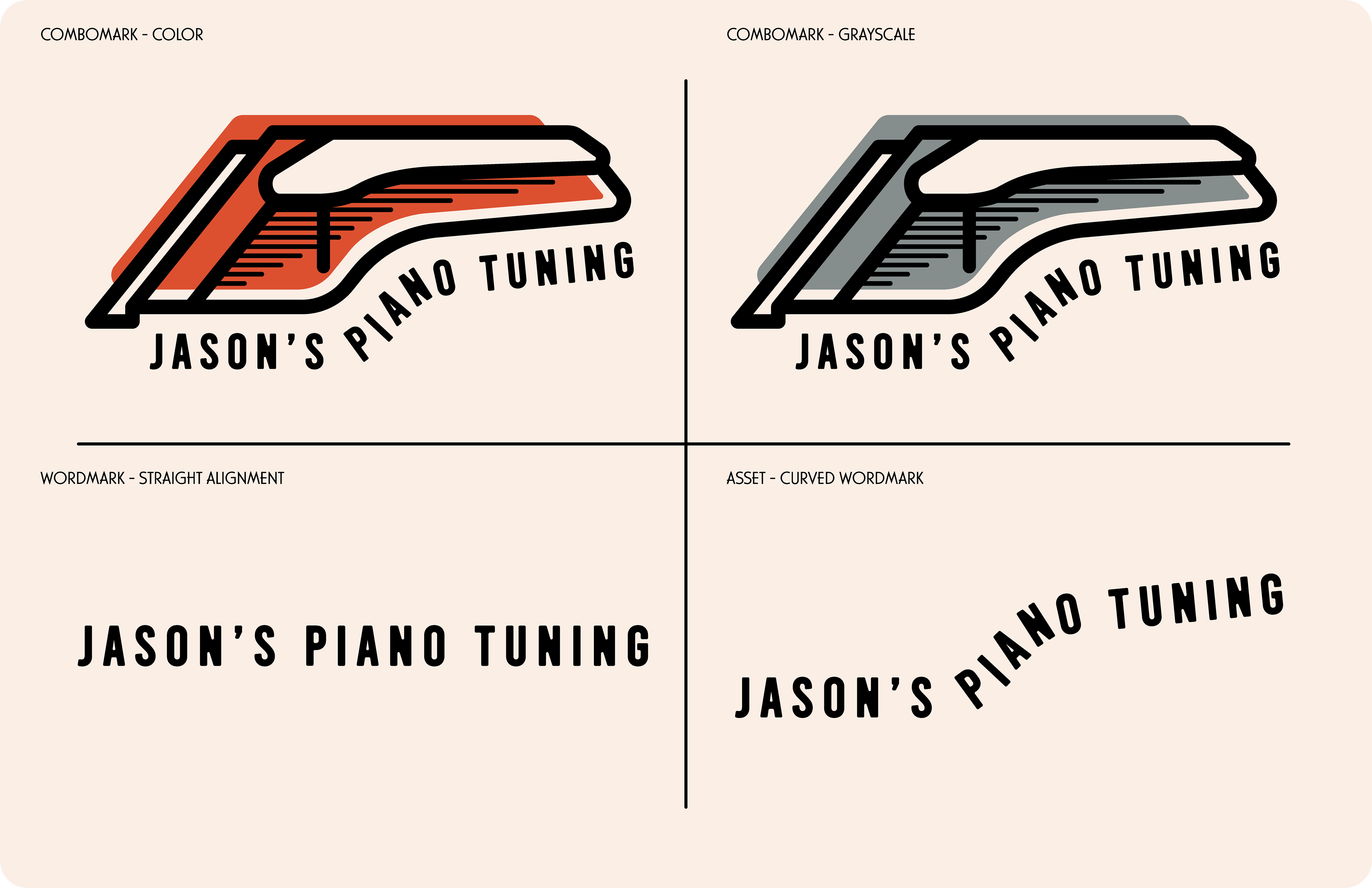
JASON'S PIANO TUNING LOGO
This retro logo is made of simple straight and curved lines, abstract enough to demand a viewer's second look, yet simple enough to not need an intense knowledge of the instrument to understand. A single line weight through the main piano outline gives that artisanal one-stroke impression, with only the piano wire represented by thinner lines.
An orange fill - offset to one side, reminiscent of block prints and other human-made printing - fills out the main area of the piano, save for the lid and keys.
"Jason's Piano Tuning" follows the curve of the piano in a condensed block typeface. Although inspired by the often elegant cursive lettering of the dingbat buildings, I opted to go with a clearer typeface due to the length of the name and where the logo will be placed in the end - small areas like business cards and invoices. The letter placement around the curve has custom spacing and tilt, while the individual corners have been modified to be rounded in order to match the rounded edges of the art.
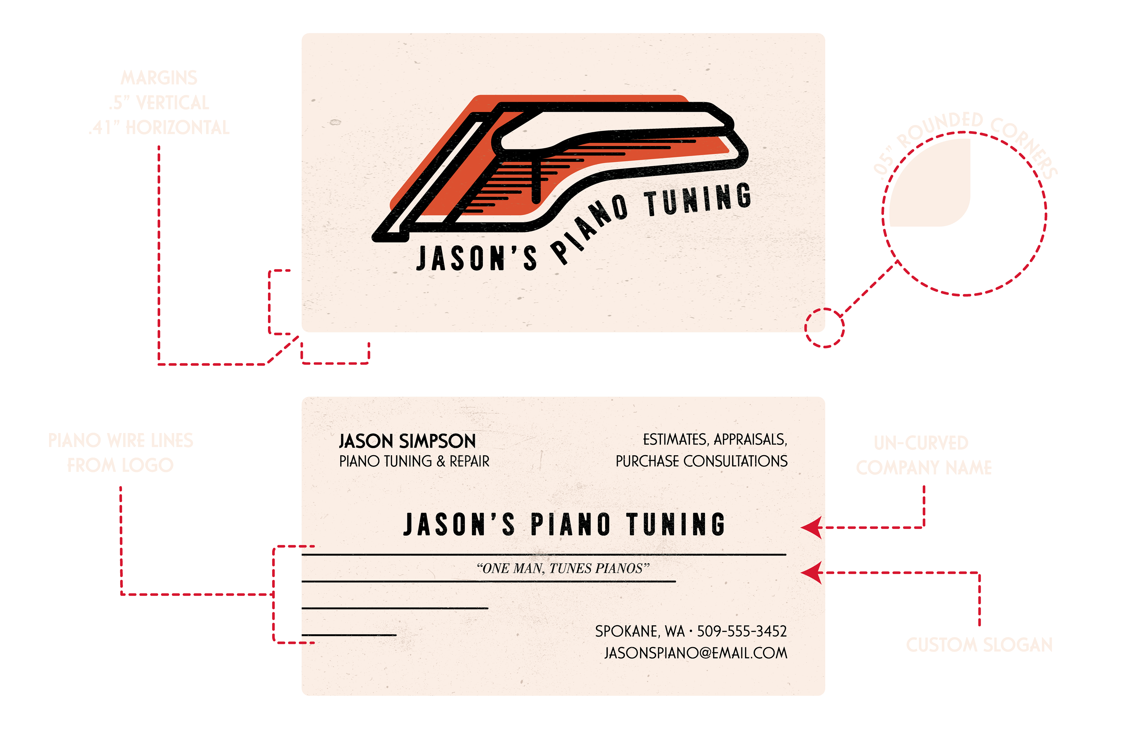
JASON'S PIANO TUNING BUSINESS CARDS
(Client's personal information has been altered for their own privacy)
The business cards are heavily inspired by the business cards from the 1950's and 60's - vastly different in both layout and information in comparison to what's popular today. In contrast to current trends of the person's name being the most important in terms of hierarchy, these mid-century cards had the business name and logo front and center with the employee's name off to the side.
Upon researching different layouts, one thing that stuck out to me was that these cards tended to have the company slogan on them. Considering this client didn't have one, I pitched one with a pun that was well received: "One man, tunes pianos". This slogan is effective in brand clarity, swiftness, and humor - a perfect representation of this business.
Quite a few cards I came across in my research had the slogan surrounded by two horizontal lines, separating it from the company name and the company information. Realizing I had the perfect way to accomplish this exact motif while also tying in elements from the logo, I used the horizontal lines used to represent the piano wires and set the top two around the slogan; this incorporates the new brand elements, a slogan highlight, and visual interest with the four lines coming out of the left side of the card in a vintage yet updated manner.
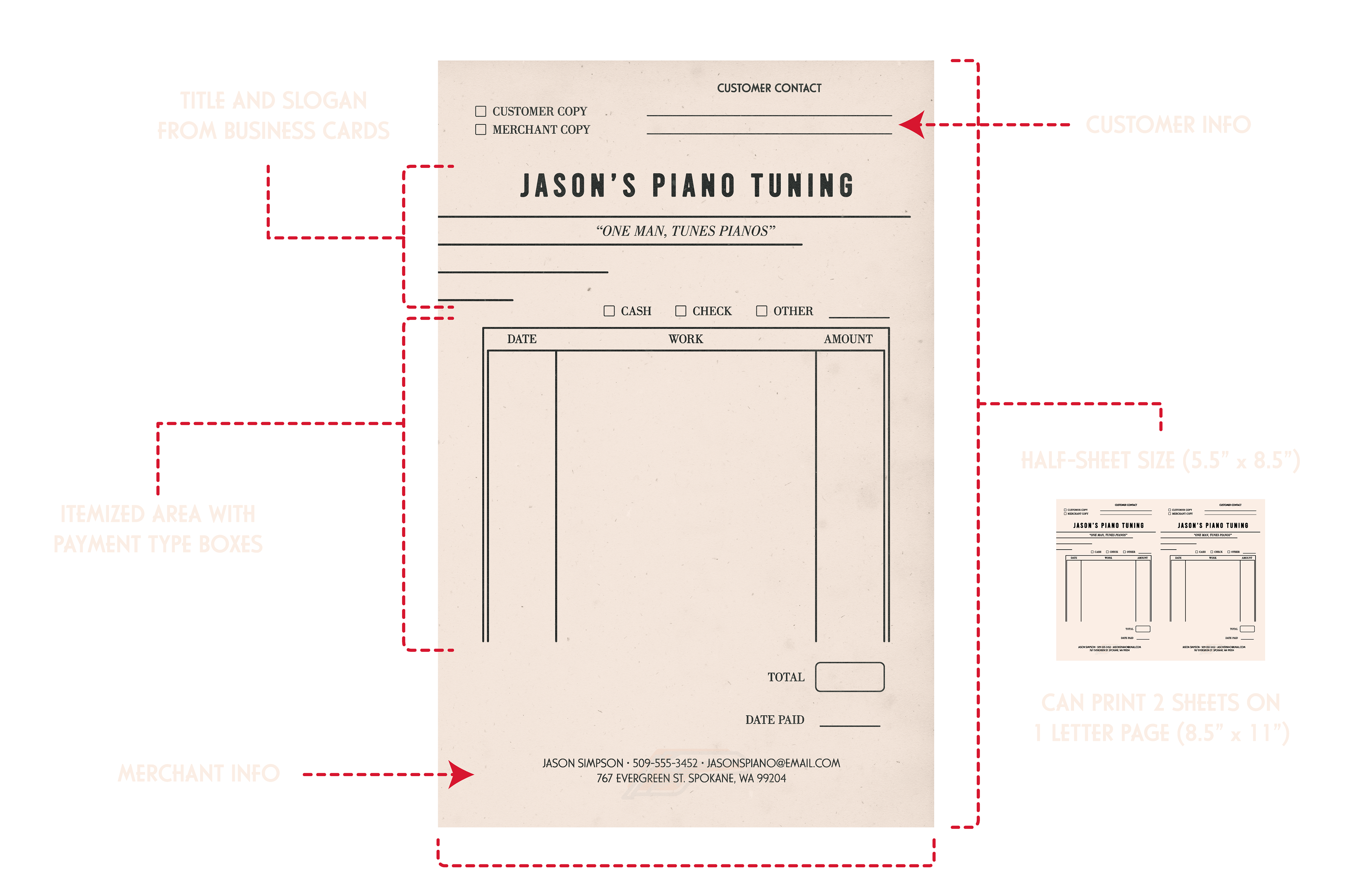
JASON'S PIANO TUNING INVOICES
(Client's personal information has been altered for their own privacy)
This invoice is designed as a half sheet (8.5" x 5.5"). Inspired dually by the condensed nature of vintage invoices and the client not typically needing a lot of room on the sheet, this size works great in saving paper and wasted space.
Continuing the logo and slogan design from the business cards, we have a very simple layout with the customer information open at the top, payment option checkboxes, and a three column work section. This client will be printing out and hand filling in the information, so a simple, open area was created to allow for variances in information and handwriting.