Peas
Short Film Poster
A short coming-of-age film centered around a young girl, a garden, and a strong dislike of peas.
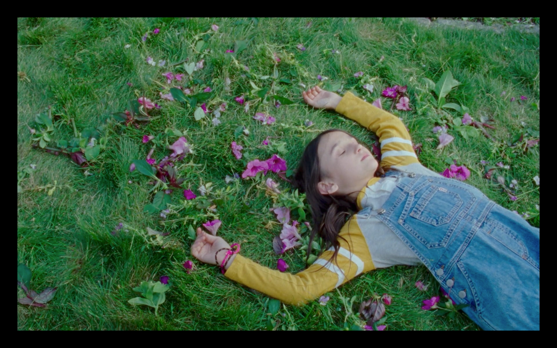
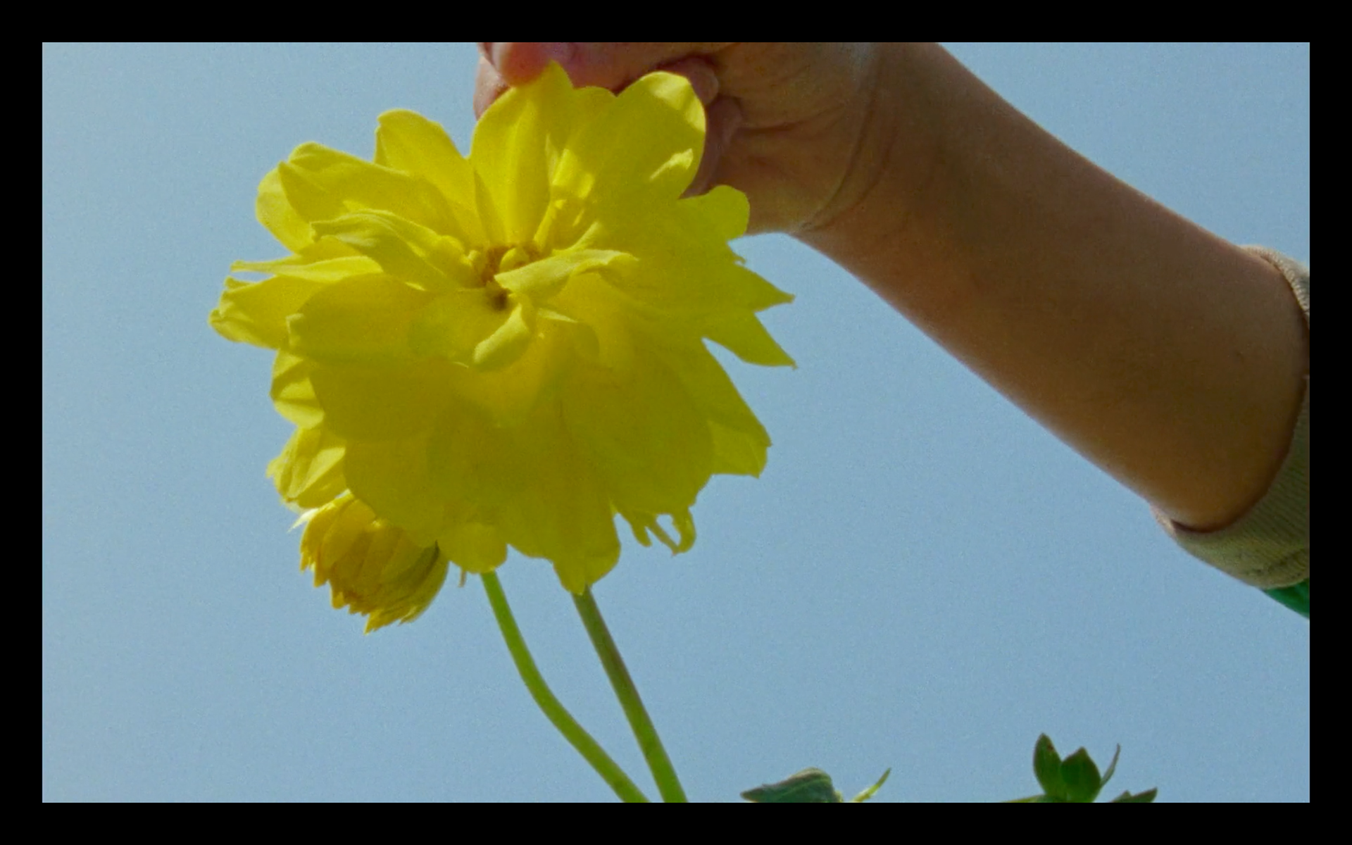
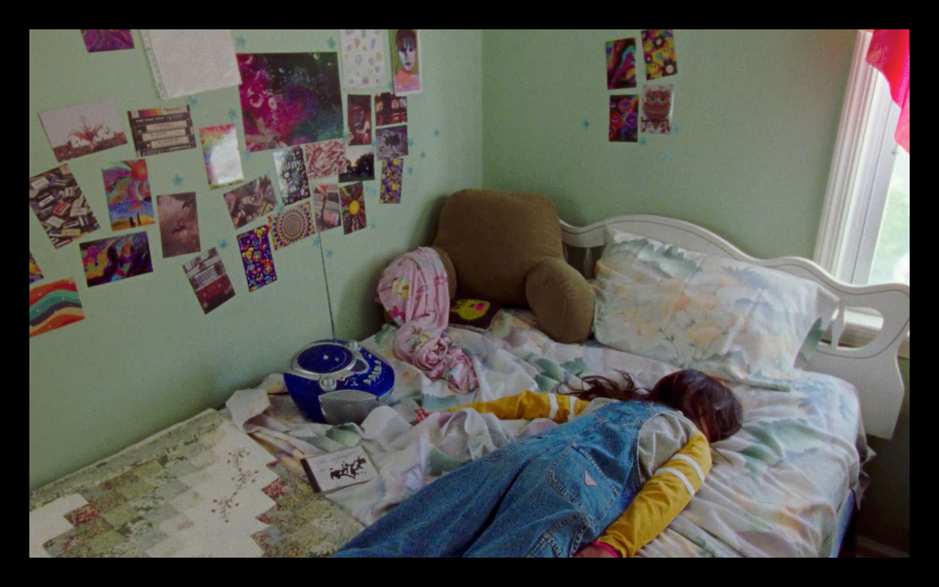
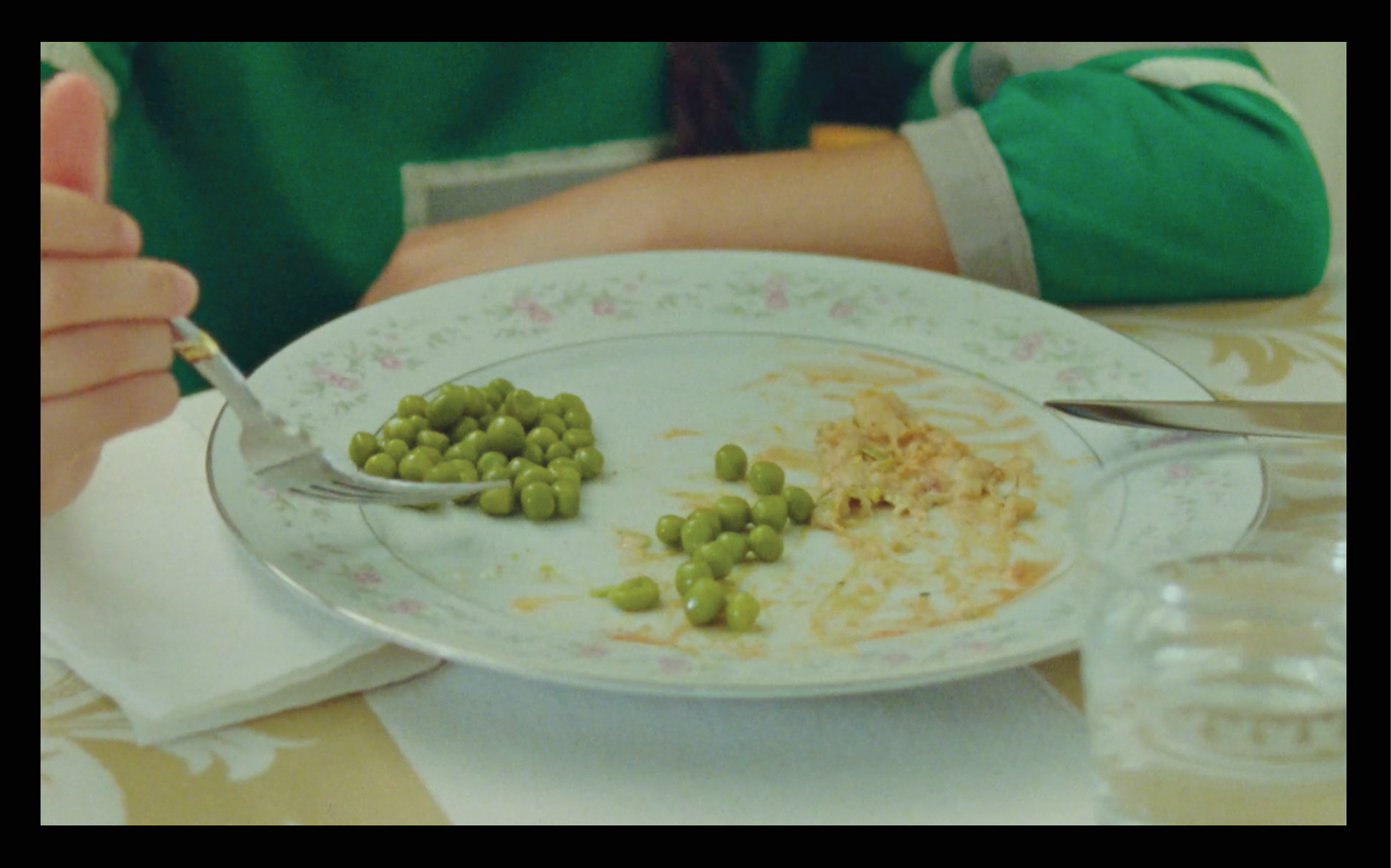
Above: Film stills that helped in identifying the style, color palette, and important subject matter for the poster.
Rough Concepts
The concepts for this poster came quickly. I had been given free rein in both style and paper orientation and I knew stylistically I wanted it to have a rougher, more child-like vibe due to the main character's age and themes within the film. I saw the poster designs in color immediately - a rarity - and put them in the roughs as well to get approval on style direction and design concept in one go - a necessity with this project having a short 20 day turnaround and open artistic direction.
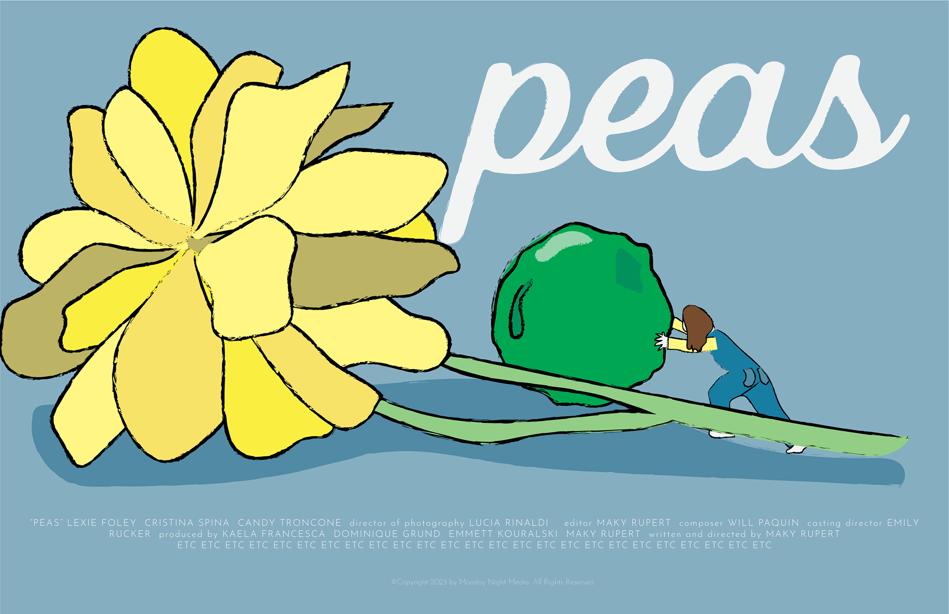
Rough 01 - "The Push"
This concept depicts the plot point of the main character using the garden - and specifically this yellow flower - as a hide-out for her unfinished peas.
Since the flowers and garden have a climactic moment later in the film, making the girl small while pushing the large pea behind an even larger flower created an interesting hierarchy that was in opposition to real life.
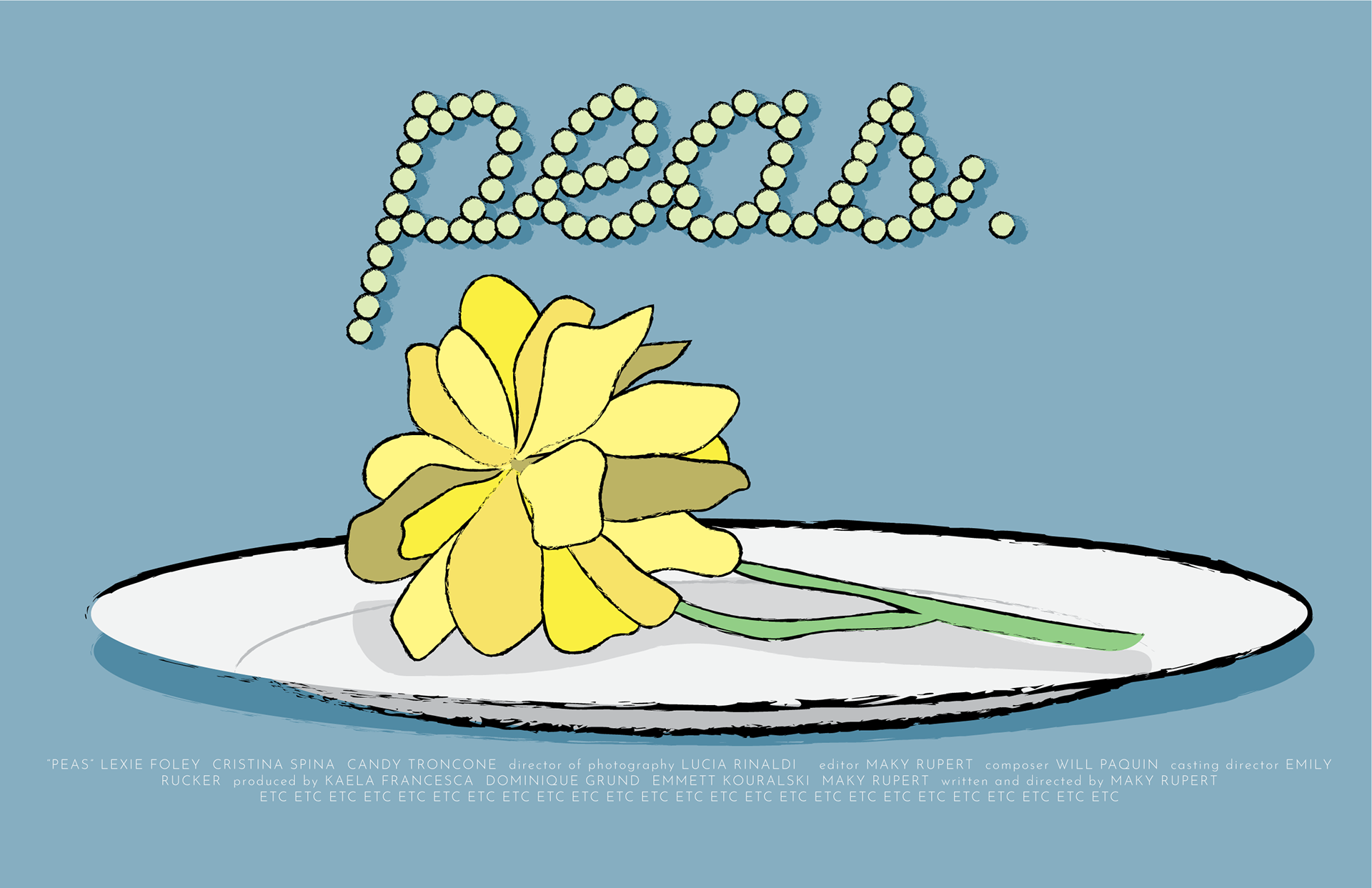
Rough 02 - "Dinner"
This rough continued the flower theme, this time placing it upon the plate seen in the movie during meals. The cursive title has now been treated as individual peas, adding a period created by a single pea at the very end as well.
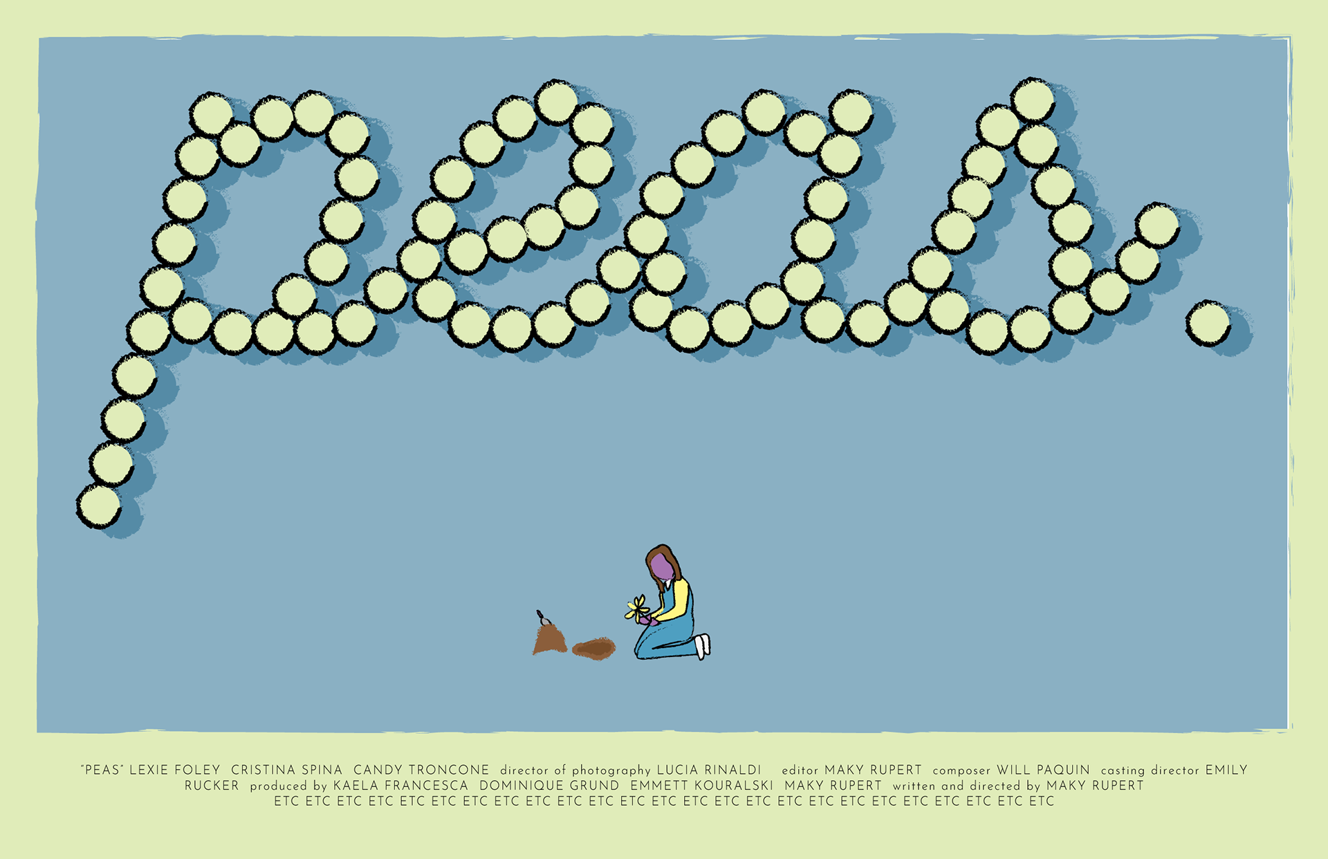
Rough 03 - "Dig"
This explores the theme of the main character feeling small and unseen. The title takes up half of the poster, whereas the girl is very small at the bottom, digging up the flower from the movie.
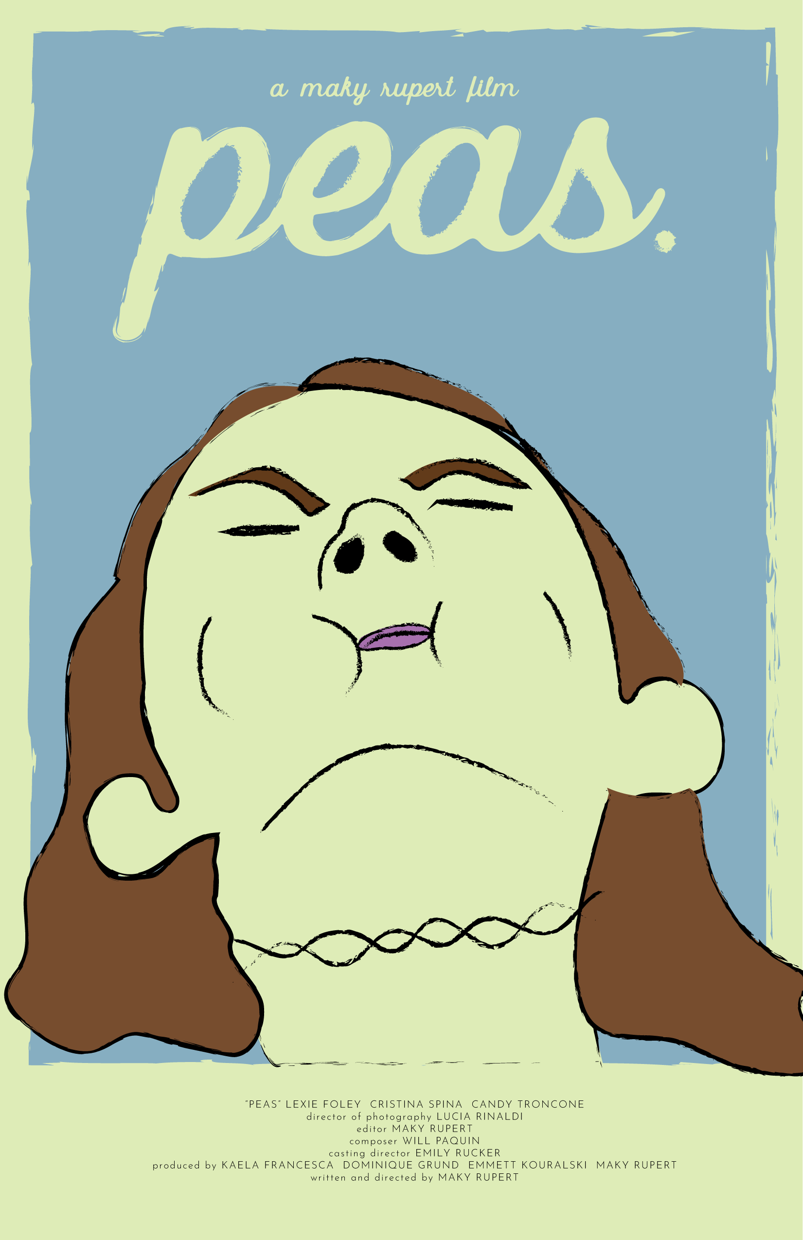
Rough 04 - "Cheeks"
This concept came from a moment in the film in which the main character looked to the sky in exasperation. This rendition has her cheeks stuffed with peas and a face of youthful frustration.
Blue, green, yellow, and purple were consistent throughout the film and were the staples in my color palette immediately - the coloring of her skin in this light green with the light blue in the background as the sky worked well in continuing this innocent art style.
Feedback
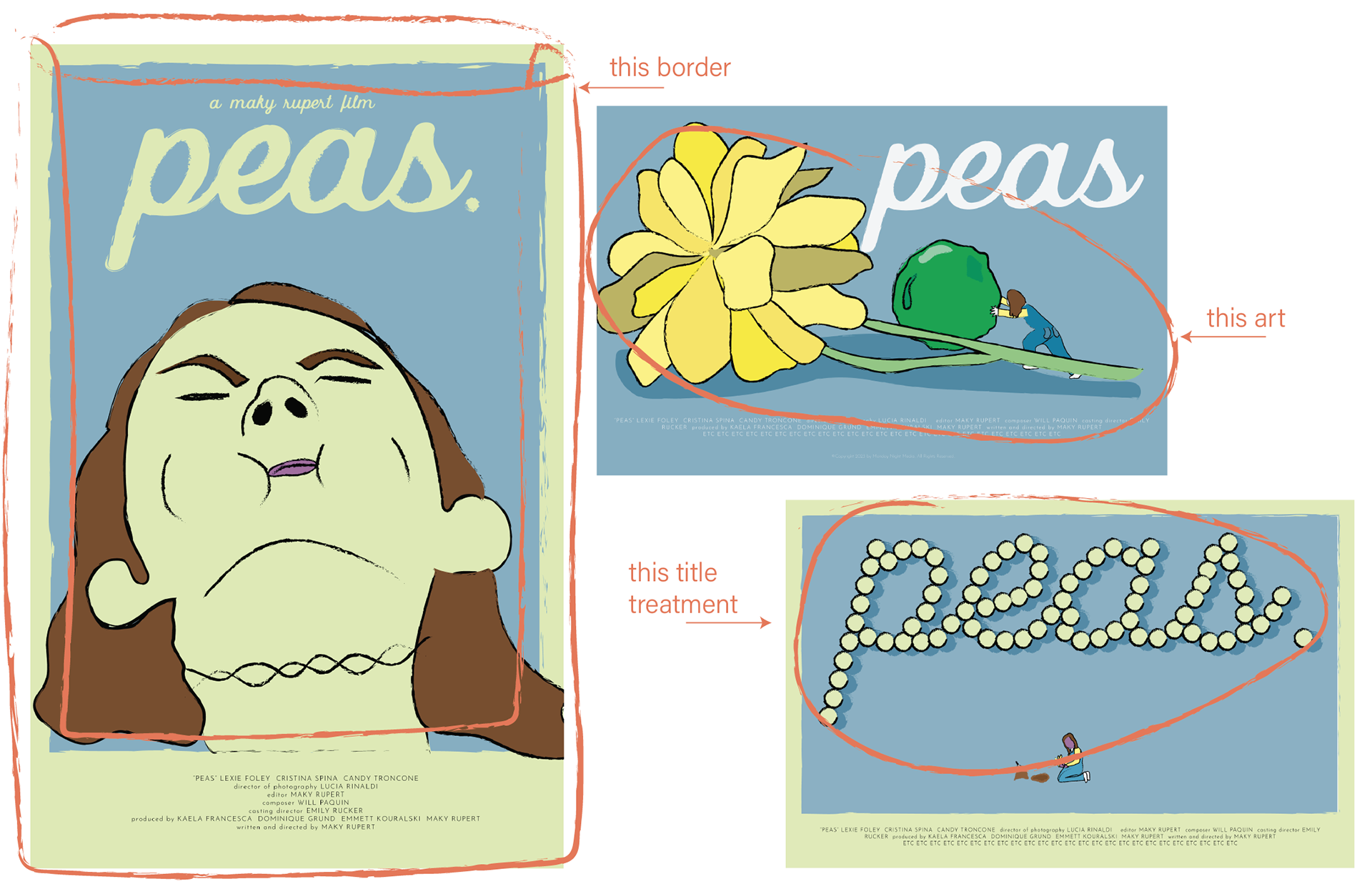
In response to these concepts, the production team ultimately decided that, first, they needed the poster in portrait format since that is the more common format in the industry. Second, they wanted to combine concepts from multiple posters into the finished product; namely the border from Rough 04, the "Peas" title style from Rough 02 and 03, and the main art from Rough 01.
FINAL
Overall the adjustments requested in the feedback session were easy to accomplish, the hardest being reworking the main art from Rough 01 to fit appropriately on a portrait layout instead of a landscape. Finding the amount of detail to include given the smaller width of the portrait orientation required lots of testing to ultimately come to the correct level of illustrated complexity.
The title treatment included all slightly varied peas with no period at the end, and shadows were added to bring more dimension to the piece. Light paper textures gave life to the illustrations, and additional textures were placed only in the shadows to help them pop.
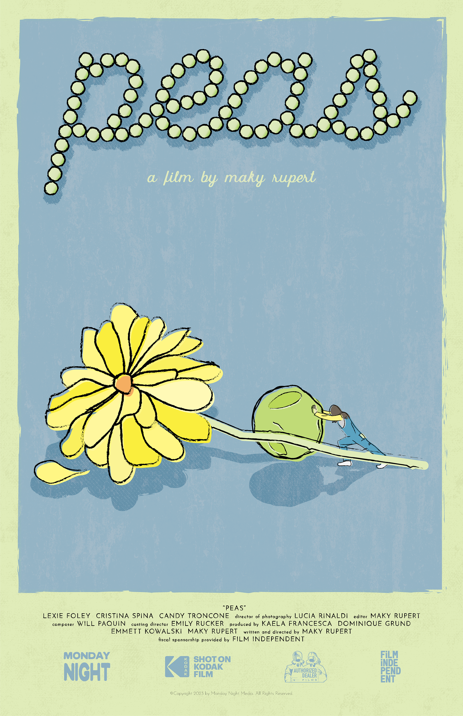
Above: Peas final poster design.